NewsBiscuit provides the details on the latest Ordnance Survey discovery:
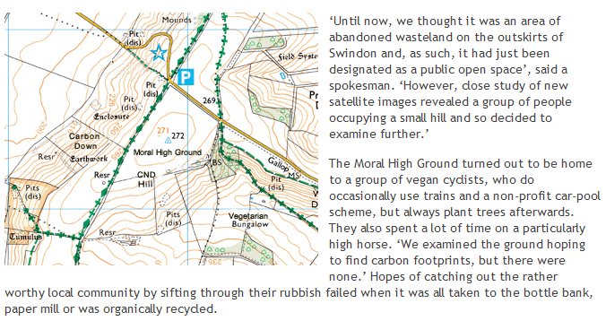

NewsBiscuit provides the details on the latest Ordnance Survey discovery:
H/T to John Farrier for the link.
A post by Jasmine Pui at History Today discusses a new online tool for economic analysis of the Roman Empire:
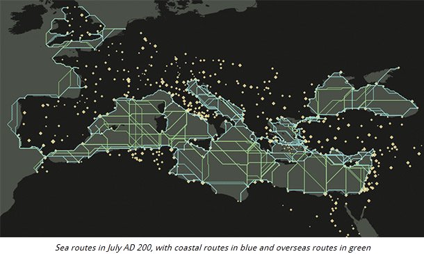
A recently launched online interactive research source, ORBIS, the Stanford Geospatial Network Model of the Roman World, has made it possible to analyse data about the Roman Empire in new ways that reveal the fragility of Roman communication and freight systems. Conventional maps are often unable to capture the environmental constraints that govern the flows of people, goods and information. Museum and ancient sites usually include titbits of information about the wide-ranging origins of artefacts, hinting at the relative cost of goods and labour in the Roman era, but factors such as sailing times and inland routes for freight cannot be precisely revealed through archaeological finds, Roman coins, taxation records or riot reports.
The first resource of its kind, ORBIS offers comprehensive graphic tools to portray the transport and communication infrastructure that underpinned the Roman Empire’s existence. By typing in a starting point, destination, an imagined weight of goods to transport and the time of year, the site shows whether such a movement would have been feasible and at what cost. Studying movement during the course of the empire’s existence suggests it was far more difficult to hold an empire together than to expand one. There are few scenarios where marching and conquering is not easier and less costly than moving goods and slaves between regions. Cost, rather than distance, was the principal determinant of connectivity in the Roman world.
ORBIS is based on a simplified version of the giant network of cities, roads, rivers and sea lanes that framed movement across the Roman Empire. The Stanford team has relied on data such as historical tide and weather information, size and grade of road surfaces and an average walking distance of 30 kilometres per day. Hundreds of cities, ports and routes, vehicle speeds for ships, ox carts and horses, as well as the variable cost of transport have been logged. The data mainly focuses on the period around AD 200, when Septimius Severus expanded control of Africa and Roman power was at one of its peaks.
What am I talking about? Digital maps:
It’s not often that maps make headlines, but they’ve been doing so with some regularity lately. Last week, tens of millions of iPhone users found that they could suddenly leave their homes again without getting either lost or cross. This was because Google finally released an app containing its own (fairly brilliant) mapping system. Google Maps had been sorely missed for several months, ever since Apple booted it in favor of the company’s own inadequate alternative — a cartographic dud blamed for everything from deleting Shakespeare’s birthplace to stranding Australian travelers in a desolate national park 43 miles away from their actual destination. As one Twitter wag declared: “I wouldn’t trade my Apple Maps for all the tea in Cuba.”
There was one potential bright spot, though: Among the many mistakes found in Apple Maps was a rather elegant solution to the continuing dispute between Japan and China over the Senkaku islands. Japan controls them; China claims them. Apple Maps, when released, simply duplicated the islands, with two sets shown side-by-side — one for Japan, one for China. Win-win. (At least until the software update.) Call it diplomacy by digital dunderheadedness.
As some may recall, it was not so long ago that we got around by using maps that folded. Occasionally, if we wanted a truly global picture of our place in the world, we would pull shoulder-dislocating atlases from shelves. The world was bigger back then. Experience and cheaper travel have rendered it small, but nothing has shrunk the world more than digital mapping.
[. . .]
There is something disappointing about the austere potential perfection of the new maps. The satellites above us have seen all there is to see of the world; technically, they have mapped it all. But satellites know nothing of the beauty of hand-drawn maps, with their Spanish galleons and sea monsters, and they cannot comprehend wanderlust and the desire for discovery. Today we can locate the smallest hamlet in sub-Saharan Africa or the Yukon, but can we claim that we know them any better? Do the irregular and unpredictable fancies of the older maps more accurately reflect the strangeness of the world?
The uncertainty that was once an unavoidable part or our relationship with maps has been replaced by a false sense of Wi-Fi-enabled omnipotence. Digital maps are the enemies of wonder. They suppress our urge to experiment and (usually) steer us from error—but what could be more irrepressibly human than those very things?
Update: And the Apple Maps fiasco has them leading most of the tech world’s “Top 10” lists for mis-steps, fumbles, and self-inflicted wounds.
There really could be only one pick for the number-one spot on this list. The Apple Maps fiasco has done more to hurt the company’s image than anything else this year, leaving their reputation — and those of some of its supporters — in the dust.
At the start of the year Apple was riding high. The loss of cofounder Steve Jobs had been handled better than many in the industry had expected, and Tim Cook looked like a safe pair of hands to take the company forward. Apple was on its way to being the most valuable in the world in dollar terms, and was beating the competition like a red-headed stepchild.
[. . .]
When iOS 6 with Apple Maps launched, there was initially little fuss. Apple’s policy of only letting friendly reviewers get advanced access to kit held up well, and virtually none of Cupertino’s chosen few even mentioned the mapping function in their glowing reviews of the new operating system. But then users actually tried it out and the results were plain to see.
Apple’s Maps app simply didn’t work correctly. Sure, it could get you from point to point — just about — but the level of detail included was poor and mapping information was frequently wrong. The list of cock-ups grew day by day as people realized that the application just wasn’t fit in any meaningful way.
Even the Australian police warned against using it for fear of getting lost in the desert.
An interview with the author of Railway Maps of the World:
At its peak, there were 92,449 kilometres of rail lines criss-crossing Canada from coast to coast. That was in 1976. Today, almost half the lines have been destroyed, dug-up, or abandoned — only 49,422 km remain in operation. Worldwide, the numbers are just as grim: from a high of 2,500,000 km in 1920, the Golden Age of rail travel, to 1,370,782 km now. Yet, there are still those who prefer the charm of the train to its air or auto brethren. Mark Ovenden is one such man. Ovenden, who enjoyed unexpected success with his 2007 book Transit Maps of the World, has recently released Railway Maps of the World. It is a celebration of beautiful maps, he says, but also a reminder of what we’ve lost. He spoke to the Post’s Mark Medley from his home in Paris.
Although the absolute reduction in rail lines in Canada is quite true, the railway companies could not earn a profit today if they’d kept all of those lines in operation. Some of the lines were abandoned as sources of traffic declined, either through depletion of the resource or improvements to road transportation. Some of the lines were abandoned once passenger traffic dropped below operating costs. Technological improvements in both locomotives and in control and signalling equipment allowed better use of the tracks, allowing redundant lines to be taken out of service.
Railways have to pay taxes on their right-of-way, so once a length of track becomes uneconomic, it will very quickly be taken out of service so that the railway doesn’t pay for maintenance of unused routes and can sell the land. For all the “romance of the rails”, railways are businesses which have to earn profits to continue operating.
Q: What does it say, then, that we were able to turn our back on railways so easily?
A: It’s a very complex and a very sad picture on many levels, from which luckily only in the last five, 10, 15 years we’re beginning to turn the corner. When you look at the influence and the power of the oil companies, and the whole automotive industry, they really were responsible — they saw it as a very deliberate policy to run down the railway services, and buy up things like streetcars and run them down again. The oil companies have blood on their hands, really. They were the ones who forced the railways to shut. They were the ones that had the tracks torn up. Under their influence people were forced to buy cars.
*cough*Bullshit*cough*
This is a lively combination of wishful thinking and conspiracy theorizing. It also nicely conflates the real business of the railways in North America — massive amounts of freight traffic — with a much smaller and unprofitable side-line — passenger service. Few railways ever earned much of their revenues from passenger traffic, which is why most modern subways, streetcars, and light rail systems are in the public sector. The railways can be built to maximize freight traffic (and therefore profit) or they can be built to maximize passenger traffic. Only organizations that do not have to earn a profit can justify concentrating on passenger service.
In the 1920s, automobiles changed from being super-expensive, finicky toys for the rich to being affordable to middle class and even some working class famlies and far more reliable (so you didn’t need to have a dedicated driver/mechanic for each vehicle). Unlike trains, where you could only go where the rails went and only when the train was going in that direction, a car allowed you to go anywhere there was a road, whenever you wanted.
It is difficult for us to grasp just how liberating this was for millions of Americans and Canadians — we’re so used to being able to go where we want at any time that we rarely even think about what it was like before the heyday of the car. Passenger trains had that kind of transformative effect in Europe, but less so in North America, where moving freight was always the primary purpose for building railways (setting aside the Union Pacific and the Canadian Pacific, as the construction of both were more influenced by government policy than profit-seeking).
This is an interesting site:

The screencap above shows the significant sites in the Mäntsälä rebellion in Finland in 1932 (no, I’d never heard of it either). Use the slider at the bottom of the screen to choose the time in history, and the map will show you the known conflicts for that period.

 Here’s the riding of Whitby-Oshawa in the 2008 election. Notice all that deep blue colour? As the legend says, the opacity of colour indicates the strength of the party in that area. Up in the Brooklin area, you can barely see the underlying road pattern for all the blueness.
You can find how blue (or red, or whatever) your riding is by using the cyberpresse.ca Interactive map (this is now available in English: the original was in French). It’s another illustration of how to use Google Maps to display geographical data in interesting ways.
This time around, I’ll at least have a Libertarian candidate to vote for: Josh Insang is running for the Libertarian Party. Check the LPC Candidate page to see if you have a Libertarian running in your riding.
It’s huge: click on the image to see the full-size version:

A fascinating NYT post looks at one of the most influential maps of the US Civil War period:

The 1860 Census was the last time the federal government took a count of the South’s vast slave population. Several months later, the United States Coast Survey — arguably the most important scientific agency in the nation at the time — issued two maps of slavery that drew on the Census data, the first of Virginia and the second of Southern states as a whole. Though many Americans knew that dependence on slave labor varied throughout the South, these maps uniquely captured the complexity of the institution and struck a chord with a public hungry for information about the rebellion.
The map uses what was then a new technique in statistical cartography: Each county not only displays its slave population numerically, but is shaded (the darker the shading, the higher the number of slaves) to visualize the concentration of slavery across the region. The counties along the Mississippi River and in coastal South Carolina are almost black, while Kentucky and the Appalachians are nearly white.
H/T to Walter Olson for the link.
When the first explorers from the warm lands around the Circle Sea travelled into the chilly hinterland they filled in the blank spaces on their maps by grabbing the nearest native, pointing at some distant landmark, speaking very clearly in a loud voice, and writing down whatever the bemused man told them. Thus were immortalised in generations of atlases such geographical oddities as Just A Mountain, I Don’t Know, What? and, of course, Your Finger You Fool.
Terry Pratchett, The Light Fantastic, 1986
Amusing infographic source including “Europe according to France”:

H/T to Cory Doctorow for the link.
To get an idea of what the poor folks in Christchurch are still going through, here is a visualization of the 664 tremors (to date):

Click here to see the full series.
H/T to Nelson Kennedy for the link.
A graphical presentation like this necessarily simplifies, but it’s still quite informative at the macro level (Maps of War):
H/T to Ghost of a Flea for the link.
At about quarter to two this afternoon, my house shook for several seconds as an earthquake measuring 5.5 struck just north of Ottawa:

H/T to Colby Cosh for the graphic link.
Update: More information from the National Post:
A moderate earthquake was felt in parts of Southern Ontario and as far as Ottawa and Montreal. The U.S. Geological Survey has reported that an earthquake measuring 5.5 struck Southern Ontario, Quebec and a large part of the Eastern U.S. According to the USGS the quake was centered around 49 km from Cumberland, Ont.
According to reports a few tremors can still be felt after minutes after the initial quake but so far there are no reports of damage.
Chris Selley rounds up the (almost unanimous) pundits’ opinions about the billion-dollar-boondoggle-summit-set:
Is it too late to cancel the G8 and G20 summits?
The National Post‘s Don Martin for the win: “No amount of righteous government bluster about living in post-9/11 protection paranoia, last week’s bank firebombing in Ottawa or the precedent of hosting two back-to-back summits can explain how an $18-million security tab for the G20 in Pittsburgh last September, which involved 4,000 police, must balloon to a billion dollars in Toronto requiring 10,000 cops on the ground.” Yup. It’s outrageous, and the government seems very oddly . . . proud of it. We can hardly wait for the Auditor-General and Parliamentary Budget Officer to find out just where this money went. Especially in a climate where Canadians are thoroughly cheesed off about government spending in the first place, it’s not too much of a stretch to say this is the sort of issue that might bring down a government.
“A case of bureaucracy gone wild,” is Jeffrey Simpson‘s uncontroversial verdict in The Globe and Mail, “or planning gone crazy, of fear sinking itself into every official’s and security person’s heart.” Imagine what we could have bought with that $1-billion! A bunch more Canada Research Chairs, or a whack of “clean-energy projects,” or assistance for “cultural groups” — so sleepy — or, hey, now we’re talking, a massive injection of cash for infrastructure on aboriginal reserves. Or, as Simpson says, “whatever.” Almost literally anything would be better. We’d arguably be better off flushing the $1-billion down the john.
For those of you looking forward to suffering through the event, here’s the official map of the restricted area around the Metro Convention Centre:

The best advice — unless you’re hoping for a run-in with the police — is to avoid Toronto for that weekend (plus a few days in either direction).


Powered by WordPress