TimeGhost Cartographic
Published 26 Jun 2026March 1941. As British troops sail to reinforce Greece ahead of the expected German invasion, the Italian Navy sees a chance to strike. A powerful battlefleet puts to sea, hoping to intercept the convoys and seize back the initiative in the Mediterranean.
But the British know something is coming.
With the Mediterranean Fleet stretched to its limits, Admiral Andrew Cunningham must make a critical decision. Relying on intelligence and naval aviation in a race against time, the Royal Navy heads out to meet the tide headed their way.
What follows is one of the most dramatic naval engagements of the Second World War, culminating in a brutal conclusion that would leave a lasting mark on the Mediterranean campaign.
June 27, 2026
Destroyed In Four Minutes – The Battle of Cape Matapan
June 24, 2026
The importance of proper maps on strategic thinking
CDR Salamander considers the use of maps — appropriate maps — to be critical for both military and civilian strategists. And the most common kind of map most people encounter is one of the worst, because it conceals more than it reveals:
If I am ever invited into someone’s personal study, office, or library — especially someone who puts themselves forward as a national security type — one of the things I not-so-subtly look for is maps, charts, or better yet, a globe.
Yes, I will judge you. It matters.
I have seen exceptionally credentialed and powerful uniformed and civilian leadership here and in Europe have an almost comical ignorance of the world in which they hold access to levers of almost unimaginable power. From a complete disinterest bordering on criminal unawareness of the bottom topography of the Baltic and Taiwan Strait, to not knowing where the Cape of Good Hope is, or even what a Great Circle Route is.
That kind of ignorance gets people killed.
They got their positions of power and influence for a whole host of reasons, but an understanding of geography and the ability to read a map was probably not one of them.
[…]
If someone says, “When you look at a map of the world …”, more likely than not, what will pop into your mind will be what is at the top of the post, the Mercator Projection.
That may be one of the contributing factors to inadequate strategic thinking in the modern age.
Of course, any attempt to represent a three-dimensional object on a two-dimensional format is going to create some problems.
You need multiple perspectives, and often the one that best serves in helping you understand the challenge of the moment.
As we continue to argue the point here, we don’t need a new force design, or national strategy, we need a national understanding.
We need to understand the fact we are a maritime and aerospace power, and those are the two domains where the majority of fighting in any war against the People’s Republic of China is going to take place.
It has a unique set of challenges that have nothing to do with politics, people, culture or anything from man; it has to do with the interface of land, water, time, and distance.
As we learned and then forgot from WWII, any war in the far reaches of the Pacific requires range, scale, and the logistics system that appreciates both and can sustain the fight forward.
[…]
What are the top-5 even the novice should get?
- AUKUS is a must-succeed. Don’t balk. Don’t stutter. Don’t be difficult. Make it work. It reinforces our left flank. Australia and the Philippines are our shield and redoubt.
- Taiwan is the stopper that keeps the PRC relatively contained. If you lose that, Guam is your new front line.
- A strong Japan and South Korea must be made stronger and closer. They are our right flank.
- What does the PRC want? Once you accept that they want everything from the line drawn from Alaska to New Zealand to their coast under their uncontested control, but are more than happy to let us have everything on the other side, then you understand what they have been doing for decades in the small island nations in the Southwest Pacific.
- People grow up with maps that emphasize Europe and the North Atlantic. This projection breaks that mental fixation, putting Europe and the North Atlantic in a minor corner of the map, almost an afterthought that barely catches the eye.
A slightly more recognizable version [of the Spilhaus Projection] is below.
February 23, 2026
Grand Strategy of the Roman Empire PART TWO
Adrian Goldsworthy. Historian and Novelist
Published 27 Aug 2025This should have posted earlier this morning, but for some reason did not.
This is the follow up to last week’s discussion of grand strategy, looking at the reactions and criticisms of Luttwak’s ideas, followed by some of my own thoughts.
February 13, 2026
Lines of Fire: Operation Husky – The Invasion of Sicily 1943 – WW2 in Animated Maps
TimeGhost Cartographic
Published 12 Feb 2026July, 1943. With the German summer offensive in the East well underway, and Allied operations in North Africa wrapped up, a decision is made to strike Axis Europe on the ground for the first real time. Sicily shall be their battleground, and the omens are good. Still, landing and commanding a huge multinational force in hostile territory is a challenge the Western Allies have not had to face head-on before, but one they must overcome if they wish to have any shot of defeating Hitler and Mussolini once and for all.
00:00 Intro
01:13 Background
04:42 Disposition
07:32 The Landings & Initial Fighting
09:34 Fighting Across the Island
11:56 Aftermath
16:38 Conclusion
(more…)
December 12, 2025
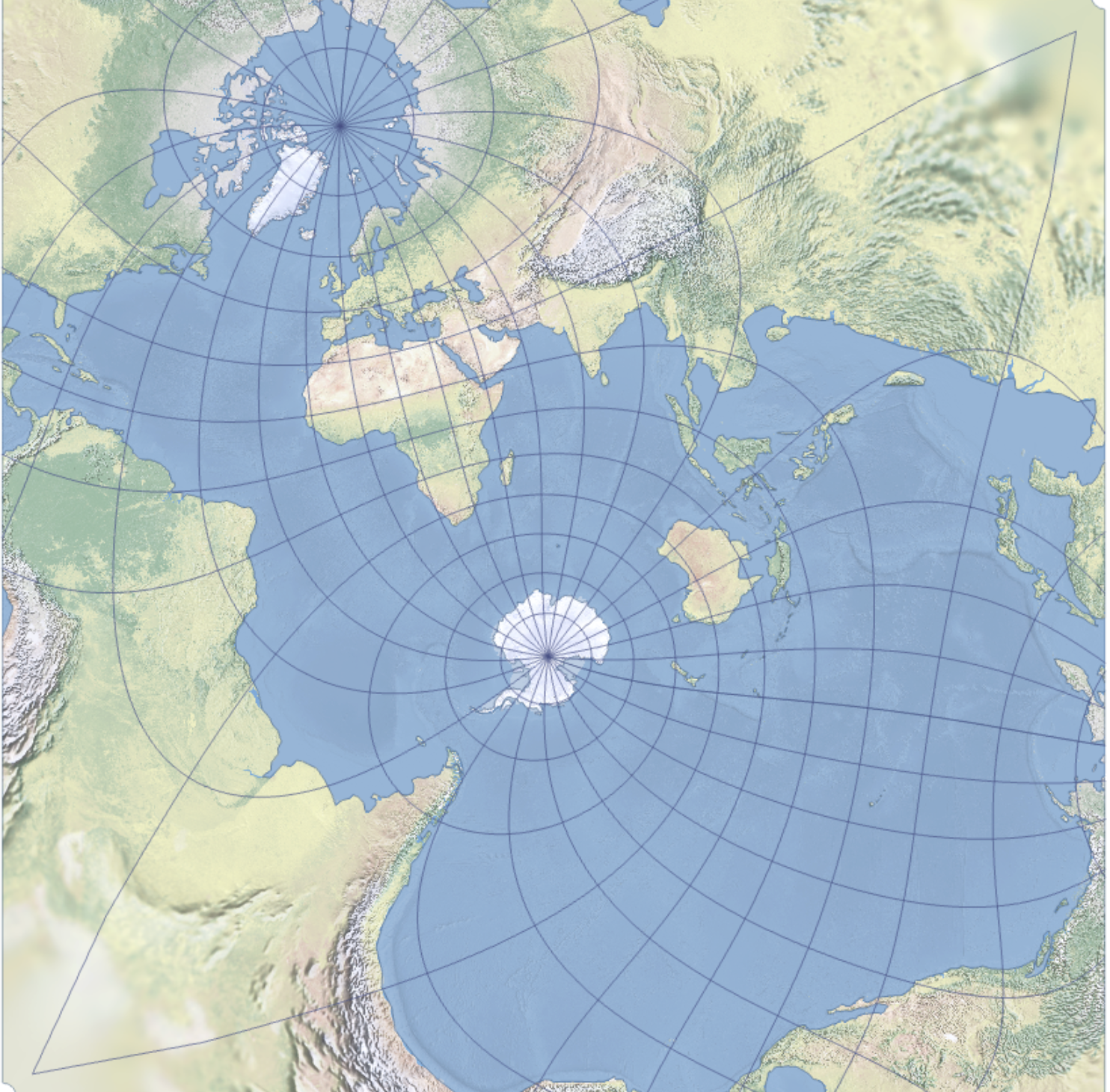
Re-orient your map to understand China’s view of the world
CDR Salamander provides a helpful guide to seeing the world, specifically their Pacific front, by turning your map sideways. I hope you won’t look back on this from a slightly later date when the maps get all flaggy and arrow-y:
I first saw this map three years ago, and it recently resurfaced in my thoughts.
I remain convinced that a lot of the problem with trying to get everyone to fully understand the challenge in the Western Pacific is that to a large part, we think in a “north-up” orientation.
I don’t think that is all that helpful.
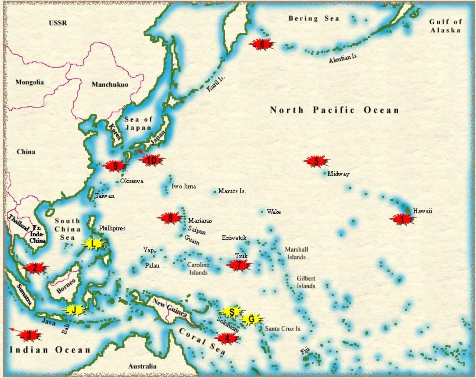
Just a few days ago, we had another Pearl Harbor Day anniversary and we’ve all seen the maps, usually centered on Hawaii, where the Imperial Japanese Navy’s Kidō Butai comes at the Pacific Fleet from stage left off the map. Then we fought battles in the Coral Sea, Midway, and so on.
To the lay eye — or to those who don’t have time to dig into the reasons — a traditional north-up map looks disjointed; things seem all over the place.
No, not really. Let’s bring back that first map.
[Click to embiggenate]
For both Imperial Japan in the early-mid 20th century and Communist China today, the most important part of this map is the access to the resources in or going through the bottom-right hand corner.
Today’s greatest bone of contention — not unrelated to the most important part of the map mentioned above — is Taiwan, right at the mouth of the funnel.
If we need to bring a fight there, that is one hell of a fight to get there if the People’s Republic of China (PRC) wants to prepare a proper welcome for us.
For the PRC, the primary military threat to plan for comes across the Pacific into a funnel that terminates at its most important SLOC. It’s the United States of America, and the US has a series of islands leading right into the heart of the PRC’s. It starts in Hawaii — Midway, Wake, Guam — and then to U.S. allies: the Philippines, Japan, and Australia.
They’re planning a layered defensive fight. Their actions make that clear.
Make no mistake, we may say we are going to “defend Taiwan”, but to do that we will have to fight an aggressive war across the Pacific, into the enemy’s prepared funnel.
Update, 13 December: Welcome, Instapundit readers! Please do have a look around at some of my other posts you may find of interest. I send out a daily summary of posts here through my Substack – https://substack.com/@nicholasrusson that you can subscribe to if you’d like to be informed of new posts in the future.
December 11, 2025
Lines of Fire: Operation Market Garden Part 2 of 2 – WW2 in Animated Maps
TimeGhost Cartographic
Published 10 Dec 2025September 17, 1944. A slight morning fog over Britain gives way to clear skies, as the first of hundreds of Allied aircraft leave the ground to execute the largest airborne operation ever attempted. Will Montgomery’s gamble pay off? Or are the Germans in the Netherlands far less beaten than he believes? Last time out we covered the planning, rationale, and logistics of the idea. Now, watch it unfold from beginning to end, map by map.
(more…)
November 6, 2025
Lines of Fire: Operation Market Garden Part 1 of 2 – WW2 in Animated Maps
TimeGhost Cartographic
Published 5 Nov, 2025September, 1944. Soviet forces push ever westwards, slicing their way through Poland en route to Berlin. In the west, the Allies have made great strides after the invasion of Normandy, but now face a winter of relative stagnation as supply issues threaten to undercut their momentum. At this time, British Field Marshal Bernard Montgomery believes has a plan to carve a corridor through occupied Netherlands and get his forces into Germany within days, striking at the heart of the German war economy, and maybe, just maybe, ending this war before 1945 dawns. In Part 1 of 2, we look over the plan, the forces involved, and the colossal effort required to make Monty’s vision a reality.
00:00 Intro
01:12 Background
04:40 Planning
07:07 Disposition of Forces
09:05 Geographic Overview
11:30 Conclusion
(more…)
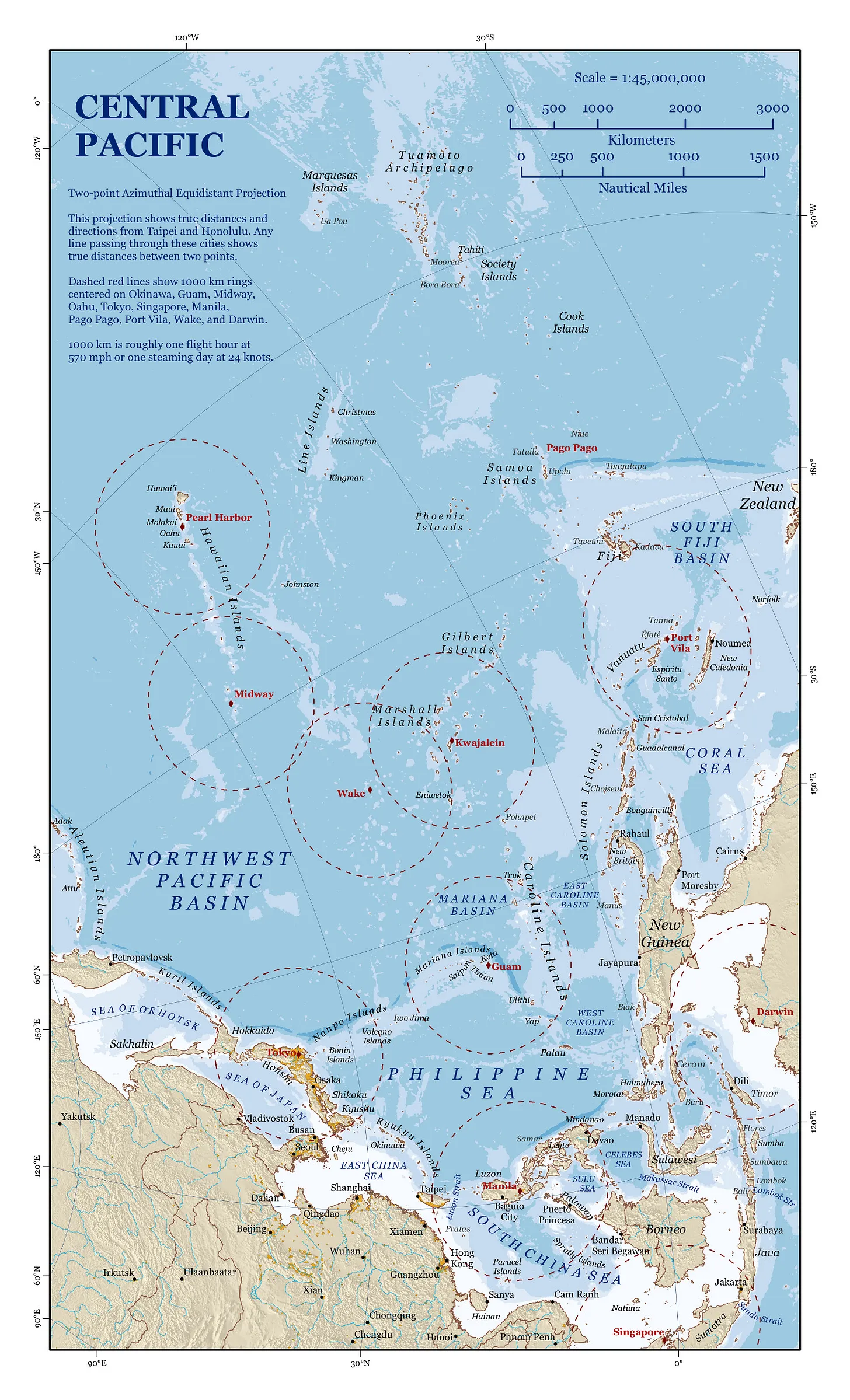
October 14, 2025
Carthaginian or Roman America?
On the social media site formerly known as Twitter:
Alaric The Barbarian @0xAlaric
There’s a handful of evidence for this. Most of it’s a little fringe or circumstantial, but it exists.
– 500s BC Carthaginian navigator Himilco described the Sargasso Sea; the original work is now lost but it was quoted in Ora Maritima a century later. If you can make it there and back, you know trade winds well enough to take Columbus’ route.
– There’s quite a lot of copper “missing” from the Great Lakes area, and there was more bronze in the Old World than could have possibly been supported by the known copper mining infrastructure there … despite 7,000-year-old copper mines in that region, the local natives didn’t seem to really use copper for much aside from odd pictographic disks.
– The Tecaxic-Calixtlahuaca head, discovered in 1933, was a bearded terracotta head made before European contact with modern-day Mexico. Its features and style don’t match local populations or material cultures, and it’s been dated to centuries prior. Roman experts ID it as 200s AD Roman art. Even the archaeological community isn’t sure what to make of this one; their best (non-)explanation is “it was a prank”.
– Numerous odd discoveries were made of Old World artifacts in the American West throughout the 19th century. Alleged Roman coins, weapons, tools, etc. Some of these were hoaxes; others have been lost to time; others seem almost covered up. The wildest example is Kincaid’s alleged 1909 discovery of an ancient Egyptian-style tunnel annex hidden in the walls of the Grand Canyon, full of artifacts; and, a similar alleged discovery around Death Valley. The former was reported to have been investigated (maybe covered up?) by the Smithsonian, though they deny this; the latter is on government land now.
– Various Old World artifacts seem to show New World goods or maps; there is a depiction of a pineapple at Pompeii, for example, and c. 350 BC Carthaginian coins show a map of the Mediterranean including the Americas to the west. Certain of Ptolemy’s odd geographic ideas are “corrected” (such as his earth-size estimate) by placing the Antilles as the Fortunate Isles. The Piri Reis Map, compiled in 1513 but surely copied from much older sources, shows a fairly accurate east coast of the Americas, as well as Antarctica. Diodorus Siculus may have even described the Americas as found by the Phoenicians, then kept secret …
– This of course predates Rome and Carthage, but a wide swathe of native cultures had extraordinarily similar oral histories of being visited by ethnically distinct people from the east who taught them aspects of civilization … “But that’s probably nothing, right?”
The field awaits its smoking gun, its Rosetta Stone. But I believe something is out there, just waiting for an enterprising follower of Schliemann to discover it. There’s *something* there.
And in response:
John Ringo SF Author @Jringo1508
The part that does it for me (that there was pre-Viking contact) is just studying the development of pottery and metallurgy in the Old World vs New.
Old World: Burnt bits of clay with markings on them. Poorly formed “pottery” charms. Better made pottery charms. Pottery dishes. Metal ore based glazes. Simple, low temperature, metals.
New World: POTTERY FULLY FORMED AND GOLD AND SILVER EXTRACTION BECAUSE NATIVE AMERICANS ARE AWESOME!
The Carthaginians had a process of going to less advanced areas, teaching them some simple “advanced” technologies that in some way helped out the Carthaginians then trading with them for “stuff”. They’d teach pottery or better pottery techniques so that they (the Carthaginians) didn’t have to load themselves down with empty pots to pick up “stuff”.
They’d then trade stuff like bronze daggers for gold, silver and spices.
So, it entirely makes sense (if you understand the currents) that a Carthaginian/Phoenician (they’re the same) trading/exploring fleet would make it across the Atlantic in one direction (probably in winter), set up a trading center somewhere and start trading wares. They’d leave a few behind to build up a store then sail back.
If they went over in winter and sailed back in summer, good chance they were wiped out by hurricanes.
It could have happened multiple times with a small group of colonists left behind. Their genes would disappear in the wash.
But going from zero to FULLY FORMED POTTERY has always been my reason to know that there was early contact.
May 10, 2025
How did ancient people travel without maps? | How did they imagine the world?
Historia Militum
Published 15 Nov 2024Today we are straying away from the Roman military, but only a bit! Travel and Geography is still a very important aspect to understand when thinking about the military logistics of the Roman Empire, but it was just as important for its administration and civilian life. This video explains why most pop culture and visual depictions of Roman maps are wrong!
Scale Maps? (0:00)
Case 1: The Island Mosaic (2:55)
Case 2: Notitia Dignitatum (3:38)
Case 3: Madaba Mosaic (4:10)
Travel itineraries (5:07)
Cursus Publicus (8:06)
The Antonine Itinerary (8:47)
Galen’s Adventure (10:10)
Milestones (13:25)
Crossroads and visual itineraries (14:56)Small mistake! At 16:36, I meant to say “topological” diagrams, which disregard the accuracy of both scale and direction. “Topographical” diagrams, on the other hand, are very much to scale!
Primary Sources:
Historia Augusta, Alexander Severus 45, 2–3
Galen, De simplicium medicamentorum temperamentis 9Secondary Sources:
Adams, C., & Laurence, R. (Eds.) (2001). Travel and Geography in the Roman Empire
The Antonine Itinerary by Bernd Löhberg: https://www.tabulae-geographicae.de/e…
March 25, 2025
How Maps Decide Battles – NATO Symbology Special
The Korean War by Indy Neidell
Published 21 Mar 2025Learn to speak the language of modern war! Today, Indy goes over some of the history and uses of NATO Joint Military Symbology and how it inspires and helps us in our own cartography department. Join us for this crash course — the perfect accompaniment to the regular series.
(more…)
February 11, 2025
Mapping the Tube 1863-2023: Treasures of the Tube Map
Jago Hazzard
Published 27 Oct 2024Mapping the Tube: 1863-2023 at The Map House is a captivating selling exhibition showcasing rare maps and materials spanning over 160 years of London’s transport history. It features the largest collection of Harry Beck manuscripts ever offered for sale, alongside early cartographic works and striking posters by 20th-century artists.
(more…)
January 31, 2025
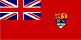
Canada – sovereign nation or “post-national state” with “no core identity”?
In The Line, Andrew Potter retraces Canada’s history from British colony to self-governing Dominion to proud mover-and-shaker in the postwar world to whatever the heck it is today:
There is a map that shows up on social media from time to time, and it looks like this.
Sometimes it is followed by this one:
And then maybe this one:
What’s the point of these maps? Apart from noting the obvious, which is that Canada is sparsely populated, and much of the population is gathered in cities very close to the border with the United States, they raise important questions about the exercise of political power and its legitimacy, forms of governance, and, ultimately, sovereignty. By what methods did Canada come to be, and by what right does a small and relatively concentrated group of people, most of whom live down by the Great Lakes or along the St. Lawrence River, lay claim to almost ten million square kilometres of the Earth’s landmass?
It is easy to draw lines on maps. Anyone can do it. If you want those lines to represent some sort of generally accepted reality, two things must be true. First, the people inside the lines need to see those lines as legitimate, and be willing to take the necessary steps, up to and including the use of force, to assert them against outsiders. And second, enough outsiders of sufficient global importance also need to recognize those lines.
Any student of Canadian history knows that the borders of Canada are highly contingent. Rewind the tape of the past, and there are any number of moments where things could have turned out differently. In some scenarios, Canada ends up smaller than it currently is; in others, Canada ends up larger, perhaps substantially so. And in some alternative histories, Canada does not exist at all — or if it does, we’re all speaking French.
There’s nothing that is either sinister or celebratory in pointing this out. History is a bunch of stuff that happened, and in some cases, things might have turned out differently. But again, if you know your Canadian history, you know that the process by which Canada went from a French fur trading outpost to a collection of British mercantile colonies to a continent-spanning multinational federation and parliamentary democracy was made possible only through a rough admixture of ambition, cunning, scheming, coercion, violence, strong foreign support, and, between 1812 and 1814, war.
To get to the point: Canada’s sovereignty wasn’t something we just stumbled upon, nor is it something we were happily given. It was a thing we did. We did not do it alone, though; for most of the 19th century, the main ongoing threat to Canada’s sovereignty was the United States, while the ultimate guarantor of that sovereignty was Great Britain.
That dynamic shifted over the first half of the 20th century, when the British Empire went into decline, and the United States became the dominant world power. There was a short period after 1931, while British influence was ebbing and that of the Americans was flowing, in which Canada stood more or less independent and autonomous. This largely ended in 1940; Britain was on the ropes against Nazi Germany, Canada was in Hitler’s sights, and an increasingly anxious Franklin Roosevelt invited Mackenzie King down to Ogdensburg, New York, for a friendly chat about continental security.


November 22, 2024
QotD: Pre-modern armies on the move
Armies generally had to move over longer distances via roads, for both logistical and pathfinding reasons. For logistics, while unencumbered humans can easily clamber over fences or small ridges or weave through forests, humans carrying heavy loads struggle to do this and pack animals absolutely cannot. Dense forests (especially old growth forests) are formidable obstacles for pack and draft animals, with a real risk of animals injuring themselves with unlucky footfalls. After all the donkey was originally a desert/savannah creature and horses evolved on the Eurasian Steppe; dense forest is a difficult, foreign terrain. But the rural terrain that would dominate most flat, arable land was little better: fields are often split by fences or hedgerows which need to be laboriously cleared (essentially making a path) to allow the work animals through. Adding wagons limits this further; pack mules can make use of narrow paths through forests or hills, but wagons pulled by draft animals require proper roads wide enough to accommodate them, flat enough that the heavy wagon doesn’t slide back and with a surface that will be at least somewhat kind on the wheels. That in turn in many cases restricts armies to significant roadways, ruling out things like farmer’s paths between fields or small informal roads between villages, though smaller screening, scouting or foraging forces could take these side roads.
(As an aside: one my enduring frustrations is the tendency of pre-modern strategy games to represent most flat areas as “plains” of grassland often with a separate “farmland” terrain type used only in areas of very dense settlement. But around most of the Mediterranean, most of the flat, cleared land at lower elevations would have been farmland, with all of the obstructions and complications that implies; rolling grasslands tend to be just that – uplands too hilly for farming.)
The other problem is pathfinding and geolocation. Figuring out where you off-road overland with just a (highly detailed) map and a compass is sufficiently difficult that it is a sport (Orienteering). Prior to 1300, armies in the broader Mediterranean world were likely to lack both; the compass (invented in China) arrives in the Mediterranean in the 1300s and detailed topographical maps of the sort that hikers today might rely on remained rare deep into the modern period, especially maps of large areas. Consequently it could be tricky to determine an army’s exact heading (sun position could give something approximate, of course) or position. Getting lost in unfamiliar territory was thus a very real hazard. Indeed, getting lost in familiar territory was a real hazard: Suetonius records that Julius Caesar, having encamped not far from the Rubicon got lost trying to find it, spent a whole night wandering trying to locate it (his goal being to make the politically decisive crossing with just a few close supporters in secrecy first before his army crossed). In the end he had to find a local guide to work his way back to it in the morning (Suet. Caes. 31.2). So to be clear: famed military genius Julius Caesar got lost trying to find a 50 mile long river only about 150 miles away from Rome when he tried to cut cross-country instead of over the roads.
Instead, armies relied on locals guides (be they friendly, bought or coerced) to help them find their way or figure out where they were on whatever maps they could get together. Locals in turn tend to navigate by landmarks and so are likely to guide the army along the paths and roads they themselves use to travel around the region. Which is all as well because the army needs to use the roads anyway and no one wants to get lost. The road and path network thus becomes a vital navigational aid: roads and paths both lead to settlements full of potential guides (to the next settlement) and because roads tend to connect large settlements and large settlements tend to be the objectives of military campaigns, the road system “points the way”. Consequently, armies rarely strayed off of the road network and were in most cases effectively confined to it. Small parties might be sent out off of the road network from the main body, but the main body was “stuck” on the roads.
That means the general does not have to cope with an infinitely wide range of maneuver possibilities but a spiderweb of possible pathways. Small, “flying columns” without heavy baggage could use minor roads and pathways, but the main body of the army was likely to be confined to well-traveled routes connecting large settlements.
Bret Devereaux, “Collections: Logistics, How Did They Do It, Part III: On the move”, A Collection of Unmitigated Pedantry, 2022-08-12.
May 28, 2024
Why a Tire Company Gives Out Food’s Most Famous Award
Tasting History with Max Miller
Published Feb 20, 2024Eugénie Brazier, the chef behind today’s recipe, was a culinary force to be reckoned with. She was described as “a formidable woman with a voice like a foghorn, rough language, and strong forearms”. Both of her restaurants won Michelin stars in the early 20th century, making her the first person to have six. No one else would earn six Michelin stars for 64 years.
By modern Michelin standards, this dish is pretty plain, but it’s still really good. The chicken is cooked simply in butter, and the cream sauce is absolutely fantastic. I was afraid the alcohol would overpower it, but it doesn’t. The sauce takes on a kind of floral woodiness instead of each individual alcohol’s flavor, and it’s so good.
(more…)
May 8, 2024
QotD: Imperial Spain’s “House of Trade”
And it was something that the English tried, for decades, to emulate. Before they embarked on their first explorations of the icy seas around Russia in the 1550s, they first poached the Casa‘s principal navigator, the Pilot Major, Sebastian Cabot. And later, during the few years that England and Spain were united in matrimony, under Mary I, one English navigator, Stephen Borough, had the chance to visit and glean some of its secrets. He was instrumental in having Spain’s key navigational manual translated in English, and he petitioned Elizabeth I to create an English version of the Casa. That dream never materialised, but the quest to emulate the Casa informed many of the smaller-scale projects — lectures, manuals, globes, and maps — which meant that the English did not sail completely into the unknown.
Anton Howes, “The House of Trade”, Age of Invention, 2019-11-13.