I have a theory that, while the battles the British fight may differ in the widest possible way, they have invariably two common characteristics — they are always fought uphill and always at the junction of two or more map sheets.
Field Marshal William Slim, “Aid to the Civil”, Unoficial History, 1959.
September 13, 2013
QotD: The constant theme of British battles through history
August 28, 2013
Hurricane and cyclone paths since 1842
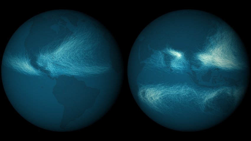
Wired‘s MapLab has a lovely visualization of both hurricane and cyclone tracks starting with the earliest records in 1842:
This map shows the paths of every hurricane and cyclone detected since 1842. Nearly 12,000 tropical cyclones have been tracked and recorded, and the National Oceanic and Atmospheric Administration keeps them all in a single database. Long-term datasets can be really interesting and scientifically valuable, and this one is undoubtedly both.
In the image above, you can clearly see that more storm tracks have overlapped in the western Pacific ocean and northern Indian ocean. This is largely because of the length of the typhoon season, which basically never stops in the warmer waters there.
The tracks of the earliest storms are based on mariner’s logs and storm records, collected from various countries, agencies and other sources. Reconciling data from these different entities was tough. Most international agencies had their own set of codes for cyclone intensity, and only recorded this information once per day. India was even using different wind thresholds to designate cyclone stages.
August 24, 2013
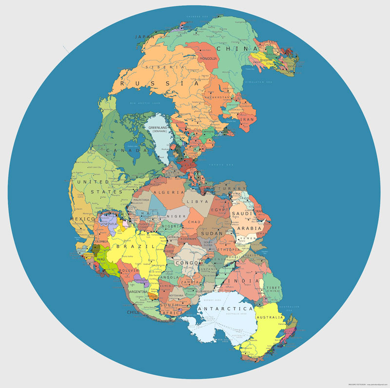
The supercontinent of Pangaea with modern borders
From TwistedSifter:
Pangaea was a supercontinent that existed during the late Paleozoic and early Mesozoic eras, forming about 300 million years ago. It began to break apart around 200 million years ago. The single global ocean which surrounded Pangaea is accordingly named Panthalassa.
July 27, 2013
Plan your travels so you’re always close to good beer
While I haven’t been travelling much in the last few years, I always appreciate the chance to sample the local wines and beers in the regions I visit. Wired Mapland looks at some mapping projects to make that even easier (for craft beer, anyway):
Researching a recent business trip to San Diego (okay, not entirely business), I checked out two of them: The Beer Mapping Project, and Brewery Map. Both utilize Google’s map API (short for application programming interface, the set of programming instructions that enables developers to build new websites and apps that tap into an existing website’s data and functions), and they’re both easy to use: type in a location, and a map and list appear telling you what’s nearby. Brewery Map has Android and iPhone apps; several independent apps use the Beer Mapping Project’s API.
“The big reason we do what we do is we think it’s important, especially with the craft beer culture that’s growing, that people get out there and connect with the beer they like to drink, and help promote small businesses making craft beer, and meet the people who are making the kind of beer they like,” said Jason Austin, one of the trio of beer-loving developers behind Pint Labs, which created Brewery Map and the database behind it, BreweryDB.com.
Both sites rely on users to enter data, from plugging in the addresses and hours of existing brewpubs to adding new ones as they crop up. That means the sites are more useful in areas with more craft beer drinkers and can be a bit spotty elsewhere. It also means the more people who use them, the better they’ll get.
Here’s a brief review of their relative strengths and weaknesses:
The Beer Mapping Project. WIRED: Lets you filter search results by type, making it easy to distinguish breweries from brewpubs, bars, and stores that sell microbrew. Click on a pin, and a window pops up with the official website, as well as links to reviews on BeerAdvocate and RateBeer. You can also look up homebrew stores. There are international maps too. TIRED: Beer trip planner isn’t very intuitive. Or maybe it doesn’t work. I got tired of trying to figure it out.
Brewery Map: WIRED: Great beer trip planner. Plug in two destinations and use a pulldown menu to indicate how far out of your way you’re willing to go for microbrew (see map above). TIRED: Designated driver not included. All the pins look the same, so if you want to find, say, a brewpub that serves food, you’ll have to do some extra Googling.
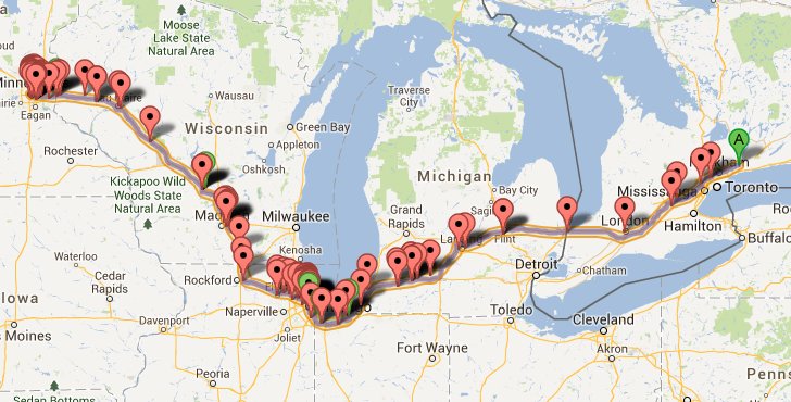
Should I decide to drive all the way to Minneapolis to catch a Vikings home game, here’s the high-level view of my trip according to BreweryMap:
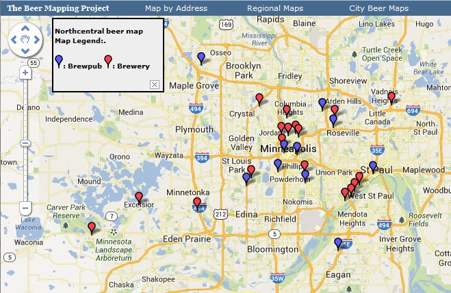
If I’d already arrived at my destination, the Beer Mapping Project comes to my thirsty aid:
July 17, 2013
World’s largest cartography class commences
Greg Miller interviews the instructor of the biggest single cartography class … a vast online class of nearly 30,000 people:
Wired: How did you get interested in geography?
Anthony Robinson: I started my undergraduate education as an electrical engineering major. Then I just randomly took a human geography class, and it completely woke me up. Right away I knew I wanted to be a geographer.
[…]
Wired: What was the motivation for the MOOC?
Robinson: Here at Penn State I direct our online geospatial education programs. I was able to make the argument that this is needed. There isn’t one yet, and I’m sure there’s a lot of untapped interest in this stuff. When I meet someone on a plane and tell them I’m a geographer, they’re like “What?” They don’t even realize that’s a thing. Something like a MOOC, that’s free and has a high profile, might get more people interested in what we do.
Wired: Why is it just happening now?
Robinson: One thing that really helps right now is we’re past the age of having mapping software that takes you weeks and weeks to have the basics. The software I’m using in the course, ArcGIS Online, works in a browser. It’s very usable. It’s not perfect but it’s quite good. Also, there are tons of datasets that are available now and searchable. Those are things we spent weeks and weeks on even when I was an undergrad, and that wasn’t that long ago. The technology threshold that it takes to make a map and do some spatial analysis has now ratcheted down to the point where it’s possible to do this with people all over the world working on different technology platforms. I don’t think I could teach this class even two years ago.
July 12, 2013
Mapping the latest British defence “disgrace”
Sir Humphrey on the mapping uproar:
Several UK newspapers reported this week the findings of the UK Parliaments Intelligence & Security Committee report that during OP ELLAMY, the UK had relied on Germany to provide mapping for the RAF to conduct its missions. This was apparently a disgraceful sign of a nation in decline and that we should all be jolly ashamed of ourselves.
The reality (as ever!) is a little different and one worth thinking about. Maps are something that we all take for granted in our daily lives, and they are an utterly indispensable part of modern military operations (even in the hands of a newly appointed young officer). We perhaps take for granted the information on them, without considering how it is obtained. In the UK the Ordnance Survey has over many hundreds of years done a phenomenal job of providing accurate information almost down to the last manhole cover about what lies where. At sea the Hydrographic Service has similarly spent many hundreds of years charting the oceans and waters of the planet — it is not an exaggeration to say that in some of the more remote parts of the globe, the only charts in use date back to the surveys done by Captain Cook or other explorers. As a national asset the Hydrographic Office in particular is absolutely priceless — very few nations run credible hydrographic programmes beyond the UK, US, Russia and China. The Royal Navy, with its extremely effective and very hard worked survey fleet has been able to become a global leader in providing accurate chart information to the world — indeed many countries are enormously reliant on the UK for providing charts for their warships.
But, to put a map or chart together is an enormously complicated piece of work which takes a lot of time and effort. No country on earth currently has the resources to provide a truly global and accurate mapping capability of all the nations and areas that it may need military mapping for. Its not just a case of putting down some generic top level mapping and hoping that’s enough — modern military operations require a lot of detail, and to be able to work effectively, mapping is needed at a very high level of detail. When it comes to targeting, knowing whether a particular target is located at grid reference 123456, or 12345678 can make a huge difference — precision weapons nowadays mean that the chances of hitting the intended spot are much higher than ever before. This means you can destroy a critical node or facility without necessarily doing much in the way of wider damage, which makes rebuilding efforts easier, and also reduces the risk of civilian casualties.
[. . .]
The irony is that amidst the anguish over using German maps, the article skims over the wider point that Defence Intelligence appears to be losing several hundred posts. It is not commonly realised that the DI is responsible for the provision of geographic information to the military, currently via the Defence Geographic Centre in Feltham (for more information see LINK HERE). This sort of service is crucial to help the MOD maintain an edge on operations — it isn’t just about having a good set of weapons, but the ability to know where you are, where you are going and how you can have the best possible military effect that matters. Ironically the papers that got the most irate about the news the UK was relying on the Germans were also the same papers that call the most loudly for ever more civil servants to be fired. The problem is that the people working at the DGC are exactly the sort of civil servants who are not pen pushers, who make a massive, near immeasurable difference to UK security, and who face considerable uncertainty in the future. We perhaps forget at our peril that just because someone doesn’t wear uniform, it doesn’t mean that they don’t play a major role in helping the defence of the UK.
June 8, 2013
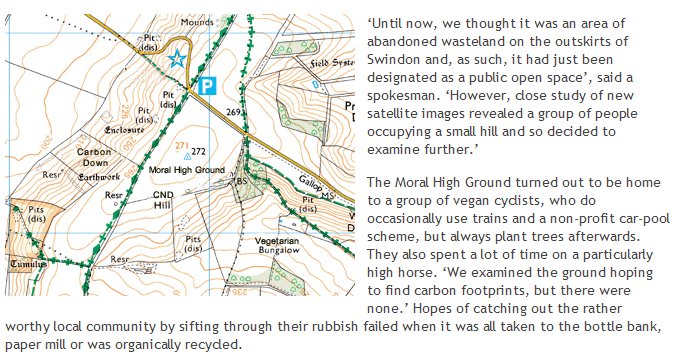
The Moral High Ground has finally been mapped
NewsBiscuit provides the details on the latest Ordnance Survey discovery:
June 7, 2013
The world’s longest undefended “no touching zone”
H/T to John Farrier for the link.
January 29, 2013
Economic analysis of Imperial Rome
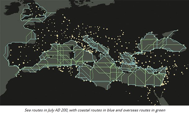
A post by Jasmine Pui at History Today discusses a new online tool for economic analysis of the Roman Empire:
A recently launched online interactive research source, ORBIS, the Stanford Geospatial Network Model of the Roman World, has made it possible to analyse data about the Roman Empire in new ways that reveal the fragility of Roman communication and freight systems. Conventional maps are often unable to capture the environmental constraints that govern the flows of people, goods and information. Museum and ancient sites usually include titbits of information about the wide-ranging origins of artefacts, hinting at the relative cost of goods and labour in the Roman era, but factors such as sailing times and inland routes for freight cannot be precisely revealed through archaeological finds, Roman coins, taxation records or riot reports.
The first resource of its kind, ORBIS offers comprehensive graphic tools to portray the transport and communication infrastructure that underpinned the Roman Empire’s existence. By typing in a starting point, destination, an imagined weight of goods to transport and the time of year, the site shows whether such a movement would have been feasible and at what cost. Studying movement during the course of the empire’s existence suggests it was far more difficult to hold an empire together than to expand one. There are few scenarios where marching and conquering is not easier and less costly than moving goods and slaves between regions. Cost, rather than distance, was the principal determinant of connectivity in the Roman world.
ORBIS is based on a simplified version of the giant network of cities, roads, rivers and sea lanes that framed movement across the Roman Empire. The Stanford team has relied on data such as historical tide and weather information, size and grade of road surfaces and an average walking distance of 30 kilometres per day. Hundreds of cities, ports and routes, vehicle speeds for ships, ox carts and horses, as well as the variable cost of transport have been logged. The data mainly focuses on the period around AD 200, when Septimius Severus expanded control of Africa and Roman power was at one of its peaks.
December 26, 2012
What we gain in accuracy we lose in romance
What am I talking about? Digital maps:
It’s not often that maps make headlines, but they’ve been doing so with some regularity lately. Last week, tens of millions of iPhone users found that they could suddenly leave their homes again without getting either lost or cross. This was because Google finally released an app containing its own (fairly brilliant) mapping system. Google Maps had been sorely missed for several months, ever since Apple booted it in favor of the company’s own inadequate alternative — a cartographic dud blamed for everything from deleting Shakespeare’s birthplace to stranding Australian travelers in a desolate national park 43 miles away from their actual destination. As one Twitter wag declared: “I wouldn’t trade my Apple Maps for all the tea in Cuba.”
There was one potential bright spot, though: Among the many mistakes found in Apple Maps was a rather elegant solution to the continuing dispute between Japan and China over the Senkaku islands. Japan controls them; China claims them. Apple Maps, when released, simply duplicated the islands, with two sets shown side-by-side — one for Japan, one for China. Win-win. (At least until the software update.) Call it diplomacy by digital dunderheadedness.
As some may recall, it was not so long ago that we got around by using maps that folded. Occasionally, if we wanted a truly global picture of our place in the world, we would pull shoulder-dislocating atlases from shelves. The world was bigger back then. Experience and cheaper travel have rendered it small, but nothing has shrunk the world more than digital mapping.
[. . .]
There is something disappointing about the austere potential perfection of the new maps. The satellites above us have seen all there is to see of the world; technically, they have mapped it all. But satellites know nothing of the beauty of hand-drawn maps, with their Spanish galleons and sea monsters, and they cannot comprehend wanderlust and the desire for discovery. Today we can locate the smallest hamlet in sub-Saharan Africa or the Yukon, but can we claim that we know them any better? Do the irregular and unpredictable fancies of the older maps more accurately reflect the strangeness of the world?
The uncertainty that was once an unavoidable part or our relationship with maps has been replaced by a false sense of Wi-Fi-enabled omnipotence. Digital maps are the enemies of wonder. They suppress our urge to experiment and (usually) steer us from error—but what could be more irrepressibly human than those very things?
Update: And the Apple Maps fiasco has them leading most of the tech world’s “Top 10” lists for mis-steps, fumbles, and self-inflicted wounds.
There really could be only one pick for the number-one spot on this list. The Apple Maps fiasco has done more to hurt the company’s image than anything else this year, leaving their reputation — and those of some of its supporters — in the dust.
At the start of the year Apple was riding high. The loss of cofounder Steve Jobs had been handled better than many in the industry had expected, and Tim Cook looked like a safe pair of hands to take the company forward. Apple was on its way to being the most valuable in the world in dollar terms, and was beating the competition like a red-headed stepchild.
[. . .]
When iOS 6 with Apple Maps launched, there was initially little fuss. Apple’s policy of only letting friendly reviewers get advanced access to kit held up well, and virtually none of Cupertino’s chosen few even mentioned the mapping function in their glowing reviews of the new operating system. But then users actually tried it out and the results were plain to see.
Apple’s Maps app simply didn’t work correctly. Sure, it could get you from point to point — just about — but the level of detail included was poor and mapping information was frequently wrong. The list of cock-ups grew day by day as people realized that the application just wasn’t fit in any meaningful way.
Even the Australian police warned against using it for fear of getting lost in the desert.
June 20, 2011
Where map collections and railway fans intersect
An interview with the author of Railway Maps of the World:
At its peak, there were 92,449 kilometres of rail lines criss-crossing Canada from coast to coast. That was in 1976. Today, almost half the lines have been destroyed, dug-up, or abandoned — only 49,422 km remain in operation. Worldwide, the numbers are just as grim: from a high of 2,500,000 km in 1920, the Golden Age of rail travel, to 1,370,782 km now. Yet, there are still those who prefer the charm of the train to its air or auto brethren. Mark Ovenden is one such man. Ovenden, who enjoyed unexpected success with his 2007 book Transit Maps of the World, has recently released Railway Maps of the World. It is a celebration of beautiful maps, he says, but also a reminder of what we’ve lost. He spoke to the Post’s Mark Medley from his home in Paris.
Although the absolute reduction in rail lines in Canada is quite true, the railway companies could not earn a profit today if they’d kept all of those lines in operation. Some of the lines were abandoned as sources of traffic declined, either through depletion of the resource or improvements to road transportation. Some of the lines were abandoned once passenger traffic dropped below operating costs. Technological improvements in both locomotives and in control and signalling equipment allowed better use of the tracks, allowing redundant lines to be taken out of service.
Railways have to pay taxes on their right-of-way, so once a length of track becomes uneconomic, it will very quickly be taken out of service so that the railway doesn’t pay for maintenance of unused routes and can sell the land. For all the “romance of the rails”, railways are businesses which have to earn profits to continue operating.
Q: What does it say, then, that we were able to turn our back on railways so easily?
A: It’s a very complex and a very sad picture on many levels, from which luckily only in the last five, 10, 15 years we’re beginning to turn the corner. When you look at the influence and the power of the oil companies, and the whole automotive industry, they really were responsible — they saw it as a very deliberate policy to run down the railway services, and buy up things like streetcars and run them down again. The oil companies have blood on their hands, really. They were the ones who forced the railways to shut. They were the ones that had the tracks torn up. Under their influence people were forced to buy cars.
*cough*Bullshit*cough*
This is a lively combination of wishful thinking and conspiracy theorizing. It also nicely conflates the real business of the railways in North America — massive amounts of freight traffic — with a much smaller and unprofitable side-line — passenger service. Few railways ever earned much of their revenues from passenger traffic, which is why most modern subways, streetcars, and light rail systems are in the public sector. The railways can be built to maximize freight traffic (and therefore profit) or they can be built to maximize passenger traffic. Only organizations that do not have to earn a profit can justify concentrating on passenger service.
In the 1920s, automobiles changed from being super-expensive, finicky toys for the rich to being affordable to middle class and even some working class famlies and far more reliable (so you didn’t need to have a dedicated driver/mechanic for each vehicle). Unlike trains, where you could only go where the rails went and only when the train was going in that direction, a car allowed you to go anywhere there was a road, whenever you wanted.
It is difficult for us to grasp just how liberating this was for millions of Americans and Canadians — we’re so used to being able to go where we want at any time that we rarely even think about what it was like before the heyday of the car. Passenger trains had that kind of transformative effect in Europe, but less so in North America, where moving freight was always the primary purpose for building railways (setting aside the Union Pacific and the Canadian Pacific, as the construction of both were more influenced by government policy than profit-seeking).
April 10, 2011
A world always at war
This is an interesting site:
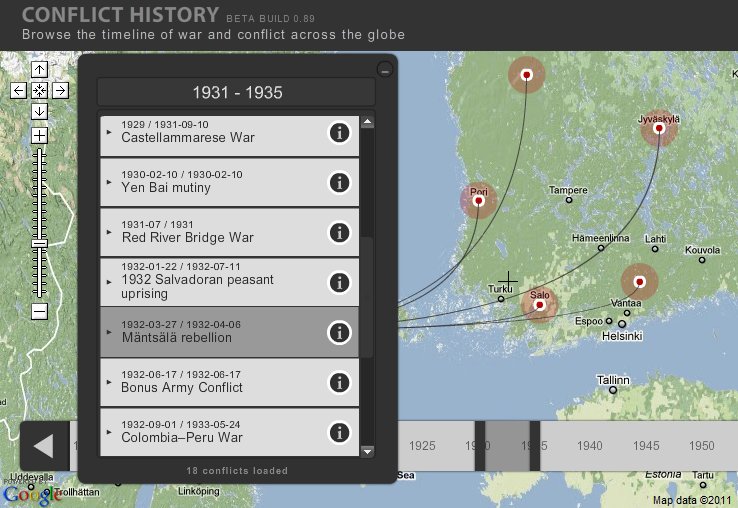
The screencap above shows the significant sites in the Mäntsälä rebellion in Finland in 1932 (no, I’d never heard of it either). Use the slider at the bottom of the screen to choose the time in history, and the map will show you the known conflicts for that period.
April 8, 2011
Graphic illustrating why I don’t expect my MP to change
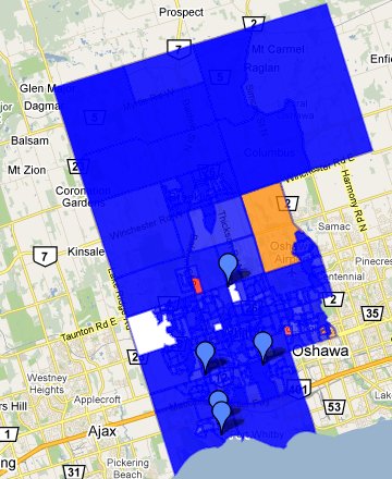
 Here’s the riding of Whitby-Oshawa in the 2008 election. Notice all that deep blue colour? As the legend says, the opacity of colour indicates the strength of the party in that area. Up in the Brooklin area, you can barely see the underlying road pattern for all the blueness.
You can find how blue (or red, or whatever) your riding is by using the cyberpresse.ca Interactive map (this is now available in English: the original was in French). It’s another illustration of how to use Google Maps to display geographical data in interesting ways.
This time around, I’ll at least have a Libertarian candidate to vote for: Josh Insang is running for the Libertarian Party. Check the LPC Candidate page to see if you have a Libertarian running in your riding.
March 20, 2011
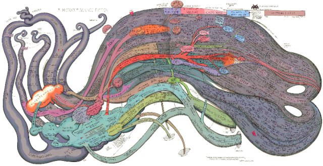
Graphic: History of Science Fiction
December 30, 2010
Cartographic explanation for the order of secession
A fascinating NYT post looks at one of the most influential maps of the US Civil War period:
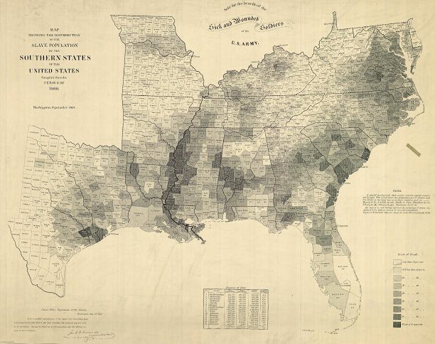
The 1860 Census was the last time the federal government took a count of the South’s vast slave population. Several months later, the United States Coast Survey — arguably the most important scientific agency in the nation at the time — issued two maps of slavery that drew on the Census data, the first of Virginia and the second of Southern states as a whole. Though many Americans knew that dependence on slave labor varied throughout the South, these maps uniquely captured the complexity of the institution and struck a chord with a public hungry for information about the rebellion.
The map uses what was then a new technique in statistical cartography: Each county not only displays its slave population numerically, but is shaded (the darker the shading, the higher the number of slaves) to visualize the concentration of slavery across the region. The counties along the Mississippi River and in coastal South Carolina are almost black, while Kentucky and the Appalachians are nearly white.
H/T to Walter Olson for the link.

