Quotulatiousness

August 31, 2023

Why New York Destroyed 3 Iconic Landmarks | Architectural Digest

Filed under: Architecture, History, Railways, Sports, USA — Tags: , , — Nicholas @ 02:00

Architectural Digest
Published 6 Apr 2023

Michael Wyetzner of Michielli + Wyetzner Architects returns to AD, this time to look at the history and creation of three New York City landmarks that have since been demolished — but are far from forgotten. From the once (and future?) majesty of Penn Station to the New York Herald building and the original 19th-century Madison Square Garden, Michael gives expert insight into these three historic architectural landmarks, why they were laid to ruin, and what came to replace them.
(more…)

May 15, 2023

Every Detail of Grand Central Terminal Explained | Architectural Digest

Filed under: Architecture, History, Railways, USA — Tags: , , , — Nicholas @ 02:00

Architectural Digest
Published 6 Jun 2018

Historian and author Anthony W. Robins and journalist Sam Roberts of the New York Times guide Architectural Digest through every detail of Grand Central Terminal. Our narrators walk us through the legendary structure from the Jacqueline Kennedy Onassis Foyer through Vanderbilt Hall to the main concourse (and the famous four-faced clock). From there, we learn more about the underground walkways, whispering gallery, Oyster Bar restaurant, Campbell Apartment, Pershing Square, and more.
(more…)

May 6, 2023

History Summarized: Chicago’s Tribune Tower

Overly Sarcastic Productions
Published 20 Jan 2023

It’s not a Dome, but it’s still pretty darn good.
(more…)

April 16, 2023

The short-term mindset in architecture

Filed under: Architecture, Britain, History, Technology — Tags: — Nicholas @ 06:00

Our house was built in the first half of the 19th century, although we’re not sure exactly when. We know it was here in the early 1840s but it could be 20 years older than that … in the first half of the 1800s, you didn’t need to get a building permit in Upper Canada before you started, and there was minimal government record-keeping at the time. Our house isn’t anything special architecturally, but it was built extremely solidly. It was intended to stand the test of time. This is not at all true for most of what we build today:

“Princes Street, New Town, Edinburgh, Scotland” by Billy Wilson Photography is licensed under CC BY-NC 2.0 .

I have had some work done on my house recently. For context, it’s an Edwardian terrace with a rear extension built sometime in the 1980s. Oddly fascinating for me was the sheer difference in build quality between the original section of the property and the newer part at the back. The older part of the house is sturdy, solid and lauded by the workmen as a “proper building”. The newer section has been a huge source of ridicule and contempt: shoddy timber placement, wobbly floors, dangerous electrical wiring, crumbling cement and poor brickwork plague it.

The tradesmen’s comments had me thinking a lot about the general quality of our infrastructure, both national and local, and how we sometimes take for granted the fact that a huge portion of what we use every day is so old. Not only that, but a lot of it is almost universally considered very beautiful and important to our shared cultural heritage.

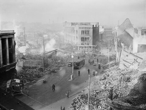
Take a stroll through any city in Great Britain, and you are more than likely to at some point come across the “old town”. Despite the Luftwaffe’s (and post war town planner’s) best efforts, a lot of pre-war buildings still inhabit the centres of our towns and cities. These prove to be fine examples of the world we used to live in. Even in the poorest of cities, my own town of Hull for example, there exists a great plethora of dramatic and beautiful buildings which were constructed, almost exclusively, by the late Georgians, Victorians and Edwardians. Take a trip to London, Edinburgh, central Durham and a number of other places, and you will see that even the lampposts are adorned gorgeously, with striking and intricate ironwork.

Why is this? Why did they bother to do such a good job? Why do we still heavily rely on their work for our own sense of cultural identity and our basic infrastructural needs? Why can’t our own contemporary efforts compete, despite great advances in the field of civil engineering and construction materials? I think the answer boils down to one thing: civic pride.

The Victorians were building for eternity; we build for temporary needs in a utilitarian fashion. They knew their “mission”, and they saw it an absolute necessity to make everything they did permanent; we do not. They designed buildings to be functional and beautiful; we seek to make buildings which will be functional for 50 years before they are “recycled”.

Speak to a modern student of architecture about their course, and you will find that very few opportunities exist for those who want to pursue a path for traditional design techniques. Their learning aim is to make things which can be used temporarily, then pulled down for something else. This is an attitude which would be totally alien to the Victorians who designed and built the lecture halls these students now learn in.

March 6, 2023

The Rise and Fall of Fast Food Architecture

Filed under: Architecture, Business, Food, History, USA — Tags: , , , — Nicholas @ 02:00

Stewart Hicks
Published 3 Nov 2022

What happened to McDonald’s? Their restaurants used to be so iconic. It was impossible to mistake one, for say, a Wendy’s. Distinguished architecture used to be an important part of a brand’s identity. But today, fast food restaurant’s all look the same. Bland grey boxes. The great convergence toward this standard has been called “Chipotle-ification”. In this video, we trace the changing restaurant designs of McDonald’s, from the iconic golden arch era to the soulless boxes of today. We break down the architecture and the forces at play in the great homogenization of fast food architecture.
(more…)

January 13, 2023

The greatest conspiracy in ancient art

Filed under: Architecture, Europe, Greece, History, Science — Tags: , , , — Nicholas @ 02:00

BBC Reel
Published 7 Sep 2022

Do we have a bias against colour in classical art?

Matt Wilson explores prejudices that have built up over centuries – leading to what has been labelled ‘chromophobia’, the subject of an exhibition at New York’s Metropolitan Museum of Art.

Wilson finds out why we don’t value colour, questioning a centuries-old misunderstanding. As Chroma’s curator Sarah Lepinski tells him: “It’s important that audiences come to understand the way they see ancient Greek and Roman sculpture isn’t the way it was first created.”
(more…)

January 6, 2023

This is the most interesting roof in London

Filed under: Architecture, Britain, History, Technology — Tags: , — Nicholas @ 02:00

Tom Scott
Published 5 Sep 2022

The @Royal Albert Hall is 150 years old; the roof is 600 tonnes of glass and steel. And it turns out that there’s a terrifying technicians’ trampoline, acoustic-dampening mushrooms, and a complete lack of connections.
(more…)

December 13, 2022

QotD: Postwar Germany

Filed under: Architecture, Germany, History, Quotations, WW2 — Tags: , — Nicholas @ 01:00

Nowhere in the world (except, perhaps, in Israel or Russia) does history weigh as heavily, as palpably, upon ordinary people as in Germany. Sixty years after the end of the Second World War, the disaster of Nazism is still unmistakably and inescapably inscribed upon almost every town and cityscape, in whichever direction you look. The urban environment of Germany, whose towns and cities were once among the most beautiful in the world, second only to Italy’s, is now a wasteland of functional yet discordant modern architecture, soulless and incapable of inspiring anything but a vague existential unease, with a sense of impermanence and unreality that mere prosperity can do nothing to dispel. Well-stocked shops do not supply meaning or purpose. Beauty, at least in its man-made form, has left the land for good; and such remnants of past glories as remain serve only as a constant, nagging reminder of what has been lost, destroyed, utterly and irretrievably smashed up.

Theodore Dalrymple, “The Specters Haunting Dresden”, City Journal, 2005-01.

December 5, 2022

QotD: Open concept house designs

Filed under: Architecture, Europe, History, Quotations — Tags: , , , — Nicholas @ 01:00

The shift from open concepts demanded by necessity to widespread construction of separate rooms to open concepts demanded by style is relatively recent. Before the 17th century, especially for the poor, “rooms did not have specialized functions”, explains architect Witold Rybczynski in Home: A Short History of an Idea. “Houses were full of people, much more so than today, and privacy was unknown.”

A single room could serve as a study in the morning, a dining room at noon, a living room in the evening, and a bedroom at night. Beds were couches, and couches were beds. Your house was your workspace, and your minimal furniture typically had no fixed arrangement, as it was constantly moved about to accommodate different uses of the only room available. (The French and Italian words for “furniture” still hint at this history: You can see the similarity to “mobile” in meubles and mobilia.)

These open concepts of old were not only motivated by different conceptions of privacy and the expense of building additional walls. They were also required for the lower classes by premodern heating technologies. A single open hearth, or, later, fireplace or stove, could warm one large room but could not do much for other, closed-off spaces. A lord or king could build a heating element into every room, but for the average family, winter warmth required most of life to happen in a single space.

As technology advanced, ideas about privacy changed, and standards of living improved over the last 500 years, ordinary people were increasingly able to move away from an open concept home, and they eagerly did so. “Rooms began to proliferate as wealthy householders discovered the satisfactions of having space to themselves,” notes Bill Bryson in At Home: A Short History of Private Life. Though the transition was slow — toilets long had “multiple seats, for ease of conversation” — rooms were increasingly devoted to particular uses, and those uses were separated from one another as much as resources permitted.

Bonnie Kristian, “Open concept homes are for peasants”, The Week, 2019-05-12.

November 27, 2022

“The uncomfortable truth is that autocrats and architects share complimentary motivations”

Filed under: Architecture, Middle East — Tags: , , , — Nicholas @ 05:00

In UnHerd, Wessie du Toit sets the Saudi Arabian “Neom” development in its true and unsavoury proper context:

There may be no philosopher kings, but there are sci-fi princes. The dreams of Mohammed bin Salman, crown prince of Saudi Arabia and chairman of the Neom board, make the techno-futurism of Silicon Valley look down to earth. Bin Salman is especially fond of the cyber-punk genre of science fiction, which involves gritty hi-tech dystopias. He has enlisted a number of prominent Hollywood visual specialists for the Neom project, including Olivier Pron of Marvel’s Guardians of the Galaxy franchise. A team of consultants was asked to develop science-fiction aesthetics for a tourist resort, resulting in “37 options, arranged alphabetically from ‘Alien Invasion’ to ‘Utopia'”. One proposal for a luxury seaside destination, which featured a glowing beach of crushed marble, was deemed insufficiently imaginative.

Such spectacular indulgence must be causing envy among the high-flying architects and creative consultants not yet invited to join the project — if there are any left. But it also makes the moral dimension difficult to ignore: how should we judge those jumping on board bin Salman’s gravy train? Saudi Arabia — in case anyone has forgotten in the years since the journalist Jamal Khashoggi was murdered at its consulate in Istanbul — is a brutal authoritarian state.

In recent weeks, this has prompted some soul-searching in the architecture community, with several stinging rebukes aimed at Neom. Writing in Dezeen, the urbanist Adam Greenfield asks firms such as Morphosis, the California-based architects designing The Line, to consider “whether the satisfaction of working on this project, and the compensation that attends the work, will ever compensate you for your participation in an ecological and moral atrocity”. Ouch. Greenfield’s intervention came a week after Rowan Moore asked in The Observer: “When will whatever gain that might arise from the creation of extraordinary buildings cease to outweigh the atrocities that go with them?”

[…]

The uncomfortable truth is that autocrats and architects share complimentary motivations. The former use architecture to glorify their regimes, both domestically and internationally, whereas the latter are attracted to the creative freedom that only unconstrained state power can provide. In democratic societies, there is always tension between the grand visions of architects and the numerous interest groups that have a say in the final result. Why compromise with planning restrictions and irate neighbours when there is a dictator who, as Greenfield puts it, “offers you a fat purse for sharing the contents of your beautiful mind with the world?”

This is not just speculation. As Koolhaas himself stated: “What attracts me about China is that there is still a state. There is something that can take initiative on a scale and of a nature that almost nobody that we know of today could even afford or contemplate.”

But really this relationship between architect and state is a triangle, with financial interests making up the third pole. Despite the oft-repeated line that business loves the stability offered by the rule of law, when it comes to building things, the money-men are as fond of the autocrat’s empty canvas as the architects are. When he first pitched the Neom project to investors in 2017, bin Salman told them: “Imagine if you are the governor of New York without having any public demands. How much would you be able to create for the companies and the private sector?”

This points us to the deeper significance of the Gulf States and China as centres of high-profile architecture. These were crucial regions for post-Nineties global capitalism: the good illiberal states. Celebrity architects brought to these places the same spectacular style of building that was appearing in Europe and North America; each landmark “iconic” and distinct but, in their shared scale and audacity, also placeless and generic. Such buildings essentially provided a seal of legitimacy for the economic and financial networks of globalisation. Can this regime’s values really be so different to ours, an investor might say, when they have a museum by Jean Nouvel, or an arts centre by Norman Foster? British architects build football stadiums and skyscrapers in Qatar and Saudi Arabia, while those governments own football stadiums and skyscrapers in Britain, such as The Shard and Newcastle’s St James’s Park.

November 7, 2022

QotD: The rise of architectural modernism

Filed under: Architecture, Books, Europe, History, Quotations — Tags: , , , — Nicholas @ 01:00

Making Dystopia is not just a cri de coeur, however. It is a detailed account of the origins, rise, effect, and hegemony of architectural modernism and its successors, and of how architecture became (to a large extent) a hermetic cult that seals itself off from the criticism of hoi polloi — among whom is included Prince Charles — and established its dominance by a mixture of ­bureaucratic intrigue, intellectual terrorism, and appeal to raw political and financial interest. If success is measured by power and hold over a profession rather than by intrinsic worth, then the modernist movement in architecture has been an almost unparalleled success. Only relatively recently has resistance begun to form, and often all too late:

    Many ingenious lovely things are gone
    That seemed sheer miracle to the multitude.

Professor Curl’s book is ­particularly strong on the historiographical lies peddled by the apologists for modernism, and on the intellectual weakness of the arguments for the necessity of modernism. For example, architectural historians and theoreticians such as Sigfried Giedion, Arthur Korn, and Nikolaus Pevsner claimed to see in modernism the logical continuation of the European architectural tradition, and Pevsner even recruited such figures as William Morris and C.F.A. Voysey as progenitors of the movement. Pevsner was so enamored of Gropius and the Modernists that he wanted to claim a noble descent for them, as humble but ambitious people were once inclined to find a distant aristocratic forebear. Yet Voysey could hardly have been more hostile to the movement that co-opted him. The Modern Movement, he said,

    was pitifully full of such faults as proportions that were vulgarly aggressive, mountebank ­eccentricities in detail, and windows built lying down on their sides. … This was false originality, the true originality having been for all time the spiritual something given to the development of traditional forms by the individual artist.

Pevsner (to whom, ­incidentally, Curl pays tribute for his past generosity to young scholars, including himself), with all the academic and moral prestige and authority that attached to his name, was able to incorporate Voysey — unable to speak for himself or protest after his death — into the direct ancestry of modernism, even though the merest glance at his work, or at that of William Morris, should have been sufficient to warn anyone that Pevsner’s historiography made a bed of Procrustes seem positively made to measure.

Theodore Dalrymple, “Crimes in Concrete”, First Things, 2019-06.

October 22, 2022

Two new works on British architecture through the years

Filed under: Architecture, Books, Britain, History — Tags: , , , , , — Nicholas @ 03:00

In The Critic, James Stevens Curl discusses two recent books on the “monuments and monstrosities” of British architecture:

The most startling achievement of the Victorian period was Britain’s urbanisation. By the 1850s the numbers living in rural parts were fractionally down on those in urban areas. By the end of Victoria’s reign more than 75 per cent of the population were town-dwellers, and a romantic nostalgic longing for a lost rural paradise was fostered by those who denigrated urbanisation. This myth of a lost rural ideal led to phenomena such as garden cities and suburbia. Anti-urbanists and critics of the era detested the one thing that gave the Victorian city its great qualities: they were frightened of and hated the Sublime.

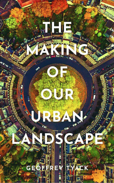
These two books deal with the urban landscape in different ways. Tyack provides a chronological narrative of the history of some British towns and cities spread over two millennia from Roman times to the present day, so his is a very ambitious work. Most towns of modern Britain already existed in some form by 1300, he rightly states, though a few were abandoned, such as Calleva Atrebatum (Silchester) in Hampshire, a haunted place of great and poignant beauty with impressive remains still visible. Most Roman towns were more successful, surviving and developing through the centuries, none more so than London. Tyack describes several in broad, perhaps too broad, terms.

He outlines the creation of dignified civic buildings from the 1830s onwards, reflecting the evolution of local government as power shifted to the growing professional, manufacturing and middle classes: fine town halls, art galleries, museums, libraries, concert halls, educational buildings and the like proliferated, many of supreme architectural importance. Yet the civic public realm has been under almost continuous attack from central government and the often corrupt forces of privatisation for the last half century.

Tyack is far too lenient when considering the unholy alliances between legalised theft masquerading as “comprehensive redevelopment”, local and national government, architects, planners and large construction firms with plentiful supplies of bulging brown envelopes. Perfectly decent buildings, which could have been rehabilitated and updated, were torn down, and whole communities were forcibly uprooted in what was the greatest assault in history on the urban fabric of Britain and the obliteration of the nation’s history and culture.

One of the worst professional crimes ever inflicted on humanity was the application of utopian modernism to the public housing-stock of Britain from the 1950s onwards: this dehumanised communities, spoiled landscapes and ruined lives, yet the architectural establishment remained in total denial. In 1968–72 the Hulme district of Manchester was flattened to make way for a modernist dystopia created by a team of devotees of Corbusianity.

The huge quarter-mile long six-storey deck-access “Crescents” were shabbily named after architects of the Georgian, Regency and early-Victorian periods (Adam, Barry, Kent and Nash). This monstrous, hubristic imposition rapidly became one of the most notoriously dysfunctional housing estates in Europe, a spectacular failure whose problems were all-too-apparent from the very beginning. Yet in The Buildings of England 1969, Manchester was praised for “doing more perhaps than any other city in England … in the field of council housing”. The “Crescents” were recognised quickly as unparalleled disasters and hated by the unfortunates forced to live there. They were demolished in the 1990s, but the creators of that hell were never punished.

October 10, 2022

How tall?

Filed under: Architecture, Government, History, USA — Tags: , — Nicholas @ 05:00

An Englishman in New York” contemplates the ideal heights of city buildings:

I have often wondered what the maximum number of storeys for a good street is. No doubt an individual building can be indefinitely high, in the right setting. But this surely cannot be true of streets: a street with a thousand storeys would either be terrifyingly dark and claustrophobic, if the street were of normal width, or vast and bleak, if its width were scaled up to correspond with its height. So there must be some maximum beyond which pleasing street-based urbanism becomes impossible.

Some people think that the maximum is two or three. These people often believe that one is moving into inhumane scales when one goes above this point. Growing up in London, I knew the maximum must be at least four or five, since that is the norm for the Georgian terraces. I have a distinct memory of visiting Paris and realising it could not be less than eight, since that is the norm for the Belle Epoque.

Visiting Manhattan for the first time, I find it must be more still. The streets of Midtown Manhattan, each 60 feet wide, are often built up to ten or twelve storeys, with four or six more slightly set back above. The avenues, 100 feet wide, are often built up to fifteen or twenty storeys, with another five or ten set back. And to be clear: I refer to the height at which they are continuously built up, excluding the towers that rise above. The avenues of New York are perhaps not paradigmatic great streets, notably because they are almost invariably packed with four lanes of traffic. But their underlying form is good, as is borne out in the handful of cases in which they have been partly pedestrianised.

These streets evolved under New York’s famous 1916 building regulations. Before 1916, New York landowners could essentially build as high as they liked, and this did indeed generate streets that were sometimes rather menacing (pictured below left). The 1916 system was designed to allow as much height as possible while preserving the amenity of the street, indexing the height of the buildings to the width of the street and setting back the upper storeys in the time-honoured European fashion (pictured below right). This system lasted until 1961, when it was replaced with modernist regulations designed to generate slab blocks standing on open plazas; the results of this were so obviously inferior that the older system has been partly reinstated.

A pre-1916 street; a post-1916 avenue

My sense is that Manhattan’s tallest 1916-61 streets could not take many more storeys without losing amenity: the regulators basically succeeded in allowing as much height as possible without compromising the public spaces. In a city at a more southerly latitude, where the light is more intense, perhaps a few could be added; and perhaps the avenues could be widened further, with a corresponding growth in the buildings. It is hard to judge imaginary streets. But at any rate, New York shows we can go a lot higher than I had once supposed: there can be great streets with twenty storeys, five or ten more under a light plane, and more again in isolated towers.

And on grid-pattern streets:

Gridiron street plans have been used for planned cities in many times and places — in Harappa, in Dynastic China, in European Antiquity, even in the Middle Ages — so I assume there must be something very good about them. But I have never quite worked out what it is. One annoying thing about gridiron plans is the great frequency of road crossings. Walking the 3.2 miles from the Empire State Building to 1 Wall Street, one must wait, by my count, at 62 traffic lights. Walking the 3.3 miles from the Tower of London to Buckingham Palace, one encounters only 12, along with 8 crossings without lights that probably do not require waiting.

That is a slightly extreme example, but I think frequency of crossings is a general truth about gridirons. A gridiron distributes crossing points evenly and regularly, such that there is no way to reduce the number that one passes. If one wants to go three blocks east and twelve blocks south in Manhattan, there is no way one can avoid traversing fifteen roads. In an organic street plan with an equal overall density of roads, the crossings will be grouped in irregular ways. If one walked randomly, one would average the same number of crossings. But of course people do not walk randomly: one chooses one’s route, with a view in part to reducing the number of roads one has to cross. And so, rather picturesquely, the street plans long called “irrational” are in this respect preferable precisely because they are used by rational creatures.

September 28, 2022

This Is Why We Can’t Have Nice Infrastructure

Filed under: Architecture, Bureaucracy, Government, USA — Tags: , , , , , — Nicholas @ 02:00

Kite & Key Media
Published 31 May 2021

America is a land of constant progress. Sometimes it seems like there’s nothing we can’t accomplish. And then we try to build something…

In recent years, infrastructure projects have taken way too long and cost way more than they should. Boston’s “Big Dig”, for example, took 15 years and cost more than 5x as much as projected. California’s High-Speed Rail was supposed to run between L.A. and San Francisco by 2020. Instead, some track nowhere near either city might be ready by 2027.

Why can’t America build quickly or cost effectively anymore? A well-intentioned regulatory law from the 1970s has a lot to do with it…

When the National Environmental Policy Act (NEPA) first took effect in the 1970s, the environmental impact analysis it required from builders before a project could begin would often run less than 10 pages. Today, the average is more than 600 pages.

Maybe delays and ballooning costs are worth it to protect the planet, right? Here’s the crazy part: NEPA doesn’t even guarantee that. In some cases, it’s actually making us less green.
(more…)

September 24, 2022

QotD: The evolution of the domestic corridor

Filed under: Architecture, Britain, Economics, History, Quotations — Tags: , — Nicholas @ 01:00

I live in an ancient city, in a medium-old apartment — one that is rapidly approaching its bicentennial. Like any building in continuous occupation for nearly 200 years, form and function have changed: it’s been retrofitted with indoor plumbing, gas central heating, electricity, broadband internet. The kitchen has shrunk, a third of it hived off to create a modern (albeit small) bathroom. The coal-burning fireplaces are either blocked or walled over. Three rooms have false ceilings, lowered to reduce heating costs before hollowcore loft insulation was a thing. What I suspect was once the servants’ bedroom is now a windowless storeroom. And rooms serve a different function. The dining room is no longer a dining room, it serves as a library (despite switching to ebooks a decade ago I have a big book problem). And so on.

But certain features of a 200 year old apartment remain constant. There are bedrooms. There is a privy (now a flushing toilet). There is a kitchen. There is a living room. And there is a corridor.

This apartment was built around 1820, for the builder of the tenement it’s part of: he was a relatively prosperous Regency working man and his family would have included servants as a matter of course in those days. And where one has servants, one perforce has corridors so that they may move about the dwelling out of sight of the owners. But it was not always so.

Rewind another 200 years and look around a surviving great house, such as Holyrood Palace, also in Edinburgh. Holyrood largely dates to the 16th and 17th century, and reflects the norms of that earlier era, and if you tour it one thing is noteworthy by its absence: corridors. The great houses of that period were laid out as a series of rooms of increasing grandeur, each leading to the next. Splendid wide main doors in the centre of each wall provided access for nobility and people of merit: much smaller, unadorned doors near the corners allowed servants to scuttle unobtrusively around the edges of the court. Staircases ascended through grand halls at the centre of such houses (accessible from doors leading to the main function rooms around the periphery): servants’ areas such as the kitchen, stores, and pantry might boast their own staircases, and the master apartments of a great house had their own stairs leading to privy or ground floor.

But the corridor in its modern, contemporary sense seems to have started out as a narrowing and humbling of the grand halls and assembly rooms of state, reduced in scope to a mere conduit for the workers who kept things running — before, of course, they later became commonplace.

Charles Stross, “Social architecture and the house of tomorrow”, Charlie’s Diary, 2019-04-29.

« Newer PostsOlder Posts »

Powered by WordPress