One of the gaming blogs I’m quite fond of had this rather neat explanation of why humans are so bad at detecting true random distribution (the rest of the post discusses this in a Guild Wars 2 context):
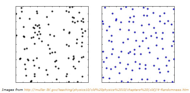
The other thing that may be a factor here is that people are terrible judges of true randomness. As an example take the following two images. Which do you think was generated by the most random process?
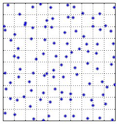
It turns out that the image on the left was generated by simply placing 100 random stars with in the fixed area using a random number generator. The image on the right was generated by first dividing the entire area into 100 squares and then randomly placing a star inside each of those squares. See for yourself in the image below. No two stars are in the same box.
It is hard for a lot of people to accept that the image with the black stars is in fact generated by a more random process than the image with the blue stars. This has a lot to do with how the human brain is constantly looking for patterns. When the brain sees these patterns it attempts to correlate them to a cause even if a cause does not exist. Essentially, this is the illusion of luck. It is why people can believe that they are on a “hot streak” or why they might believe an object gives them an increased chance at success. Some call this the Gambler’s fallacy. In the end it is all the same thing. People are terrible judges of randomness. That is why we invented statistics.