Published on 14 Jun 2017
Poverty is a big deal – it affects about 41 million people in the United States every year – yet the federal government spends a huge amount of money to end poverty. So much of the government’s welfare spending gets eaten up by bureaucracy, conflicting programs, and politicians presuming they know how people should spend their own money. Obviously, this isn’t working.
This week on Words and Numbers, Antony Davies and James R. Harrigan delve into how people can really become less poor and what that means for society and the government.
June 15, 2017
Words & Numbers: What You Should Know About Poverty in America
May 30, 2017
QotD: The uses of IQ
Suppose that the question at issue regards individuals: “Given two 11 year olds, one with an IQ of 110 and one with an IQ of 90, what can you tell us about the differences between those two children?” The answer must be phrased very tentatively. On many important topics, the answer must be, “We can tell you nothing with any confidence.” It is well worth a guidance counselor’s time to know what these individual scores are, but only in combination with a variety of other information about the child’s personality, talents, and background. The individual’s IQ score all by itself is a useful tool but a limited one.
Suppose instead that the question at issue is: “Given two sixth-grade classes, one for which the average IQ is 110 and the other for which it is 90, what can you tell us about the difference between those two classes and their average prospects for the future?” Now there is a great deal to be said, and it can be said with considerable confidence — not about any one person in either class but about average outcomes that are important to the school, educational policy in general, and society writ large. The data accumulated under the classical tradition are extremely rich in this regard, as will become evident in subsequent chapters.
[…]
We agree emphatically with Howard Gardner, however, that the concept of intelligence has taken on a much higher place in the pantheon of human virtues than it deserves. One of the most insidious but also widespread errors regarding IQ, especially among people who have high IQs, is the assumption that another person’s intelligence can be inferred from casual interactions. Many people conclude that if they see someone who is sensitive, humorous, and talks fluently, the person must surely have an above-average IQ.
This identification of IQ with attractive human qualities in general is unfortunate and wrong. Statistically, there is often a modest correlation with such qualities. But modest correlations are of little use in sizing up other individuals one by one. For example, a person can have a terrific sense of humor without giving you a clue about where he is within thirty points on the IQ scale. Or a plumber with a measured IQ of 100 — only an average IQ — can know a great deal about the functioning of plumbing systems. He may be able to diagnose problems, discuss them articulately, make shrewd decisions about how to fix them, and, while he is working, make some pithy remarks about the president’s recent speech.
At the same time, high intelligence has earmarks that correspond to a first approximation to the commonly understood meaning of smart. In our experience, people do not use smart to mean (necessarily) that a person is prudent or knowledgeable but rather to refer to qualities of mental quickness and complexity that do in fact show up in high test scores. To return to our examples: Many witty people do not have unusually high test scores, but someone who regularly tosses off impromptu complex puns probably does (which does not necessarily mean that such puns are very funny, we hasten to add). If the plumber runs into a problem he has never seen before and diagnoses its source through inferences from what he does know, he probably has an IQ of more than 100 after all. In this, language tends to reflect real differences: In everyday language, people who are called very smart tend to have high IQs.
All of this is another way of making a point so important that we will italicize it now and repeat elsewhere: Measures of intelligence have reliable statistical relationships with important social phenomena, but they are a limited tool for deciding what to make of any given individual. Repeat it we must, for one of the problems of writing about intelligence is how to remind readers often enough how little an IQ score tells about whether the human being next to you is someone whom you will admire or cherish. This thing we know as IQ is important but not a synonym for human excellence.
Charles Murray, “The Bell Curve Explained”, American Enterprise Institute, 2017-05-20.
May 18, 2017
You Can’t Trust Employment Statistics
Published on 17 May 2017
There is no truly good way to measure unemployment, which makes it pretty easy for successive administrations to claim that unemployment is consistently improving. But when we do our level best to include all of the unemployed in the numbers, what we learn is that unemployment levels now are higher than they were at the beginning of the Great Recession. That’s the bad news. The good news is that things actually have been getting better over time. In this week’s episode, James and Antony take a look at the actual unemployment numbers to get to the bottom of what they really mean.
Get the facts here:
https://fee.org/articles/you-cant-trust-unemployment-statistics/
May 11, 2017
Words & Numbers: The Minimum Wage Conspiracy
Published on 10 May 2017
This week, James & Antony tackle minimum wage laws and present some hard facts that might surprise a lot of people.
See the YouTube description for a long list of links related to this discussion.
May 7, 2017
Deadly Africa
Kim du Toit reposted something he wrote back in 2002 about the dangers to life and limb people face in Africa before you factor in dysfunctional governments, terrorists, and continuing ethnic disputes from hundreds of years ago:
When it comes to any analysis of the problems facing Africa, Western society, and particularly people from the United States, encounter a logical disconnect that makes clear analysis impossible. That disconnect is the way life is regarded in the West (it’s precious, must be protected at all costs etc.), compared to the way life, and death, are regarded in Africa. Let me try to quantify this statement.
In Africa, life is cheap. There are so many ways to die in Africa that death is far more commonplace than in the West. You can die from so many things: snakebite, insect bite, wild animal attack, disease, starvation, food poisoning… the list goes on and on. At one time, crocodiles accounted for more deaths in sub-Saharan Africa than gunfire, for example. Now add the usual human tragedy (murder, assault, warfare and the rest), and you can begin to understand why the life expectancy for an African is low — in fact, horrifyingly low, if you remove White Africans from the statistics (they tend to be more urbanized, and more Western in behavior and outlook). Finally, if you add the horrifying spread of AIDS into the equation, anyone born in sub-Saharan Africa this century will be lucky to reach age forty.
I lived in Africa for over thirty years. Growing up there, I was infused with several African traits — traits which are not common in Western civilization. The almost-casual attitude towards death was one. (Another is a morbid fear of snakes.)
So because of my African background, I am seldom moved at the sight of death, unless it’s accidental, or it affects someone close to me. (Death which strikes at total strangers, of course, is mostly ignored.) Of my circle of about eighteen or so friends with whom I grew up, and whom I would consider “close”, only about eight survive today — and not one of the survivors is over the age of fifty. Two friends died from stepping on landmines while on Army duty in Namibia. Three died in horrific car accidents (and lest one thinks that this is not confined to Africa, one was caused by a kudu flying through a windshield and impaling the guy through the chest with its hoof — not your everyday traffic accident in, say, Florida). One was bitten by a snake, and died from heart failure. Another two also died of heart failure, but they were hopeless drunkards. Two were shot by muggers. The last went out on his surfboard one day and was never seen again (did I mention that sharks are plentiful off the African coasts and in the major rivers?). My experience is not uncommon in South Africa — and north of the Limpopo River (the border with Zimbabwe), I suspect that others would show worse statistics.
The death toll wasn’t just confined to my friends. When I was still living in Johannesburg, the newspaper carried daily stories of people mauled by lions, or attacked by rival tribesmen, or dying from some unspeakable disease (and this was pre-AIDS Africa too) and in general, succumbing to some of Africa’s many answers to the population explosion. Add to that the normal death toll from rampant crime, illness, poverty, flood, famine, traffic, and the police, and you’ll begin to get the idea.
My favorite African story actually happened after I left the country. An American executive took a job over there, and on his very first day, the newspaper headlines read:
“Three Headless Bodies Found”.
The next day: “Three Heads Found”.
The third day: “Heads Don’t Match Bodies”.You can’t make this stuff up.
April 30, 2017
[p-hacking] “is one of the many questionable research practices responsible for the replication crisis in the social sciences”
What happens when someone digs into the statistics of highly influential health studies and discovers oddities? We’re in the process of finding out in the case of “rockstar researcher” Brian Wansink and several of his studies under the statistical microscope:
Things began to go bad late last year when Wansink posted some advice for grad students on his blog. The post, which has subsequently been removed (although a cached copy is available), described a grad student who, on Wansink’s instruction, had delved into a data set to look for interesting results. The data came from a study that had sold people coupons for an all-you-can-eat buffet. One group had paid $4 for the coupon, and the other group had paid $8.
The hypothesis had been that people would eat more if they had paid more, but the study had not found that result. That’s not necessarily a bad thing. In fact, publishing null results like these is important — failure to do so leads to publication bias, which can lead to a skewed public record that shows (for example) three successful tests of a hypothesis but not the 18 failed ones. But instead of publishing the null result, Wansink wanted to get something more out of the data.
“When [the grad student] arrived,” Wansink wrote, “I gave her a data set of a self-funded, failed study which had null results… I said, ‘This cost us a lot of time and our own money to collect. There’s got to be something here we can salvage because it’s a cool (rich & unique) data set.’ I had three ideas for potential Plan B, C, & D directions (since Plan A had failed).”
The responses to Wansink’s blog post from other researchers were incredulous, because this kind of data analysis is considered an incredibly bad idea. As this very famous xkcd strip explains, trawling through data, running lots of statistical tests, and looking only for significant results is bound to turn up some false positives. This practice of “p-hacking” — hunting for significant p-values in statistical analyses — is one of the many questionable research practices responsible for the replication crisis in the social sciences.
H/T to Kate at Small Dead Animals for the link.
April 29, 2017
“Don’t count fat; don’t fret over what kind of fat you’re getting, per se. Just go for walks and eat real food”
Earlier this week, Colby Cosh rounded up some recent re-evaluations of “settled food science”:
Their first target was the Sydney Diet Heart Study (1966-73), in which 458 middle-aged coronary patients were split into a control group and an experimental group. The latter group was fed loads of “healthy” safflower oil and safflower margarine in place of saturated fats. Even at the time it was noticed that the margarine-eaters died sooner, although their total cholesterol levels went down: the investigators sort of shrugged and wrote that heart patients “are not a good choice for testing the lipid hypothesis.” Their data, looked at now, shows that the increased mortality in the margarine group was attributable specifically to heart problems.
The team’s reanalysis of the Minnesota Coronary Experiment (1968-73) is more hair-raising. This study involved nearly 10,000 Minnesotans at old-age homes and mental hospitals. The investigators had near-complete control of the subjects’ diets, and were able to autopsy the ones who died. But much of their data, including the autopsy results, ended up misplaced or ignored. Some of it disappeared into a master’s thesis by a young statistician, now a retired older chap, who helped with the 2016 paper and is named at its head as one of the authors.
In the Minnesota study, replacement of saturated fats with corn oil led, again, to reductions in total cholesterol. This finding was touted at major conferences, and it became one of the key moments in the creation of the classic diet-heart myth. This time nobody but the guy who wrote the thesis even noticed that the patients in the corn oil group were, overall, dying a little faster. The 2016 re-analysis uncovered a dose-response relationship: the more the patients’ total cholesterol decreased, the faster they died.
The Sydney and Minnesota studies themselves may have caused a few premature deaths, which is a possibility we accept as the price of science. But the limitations and omissions of the researchers, and the premature commitment of doctors to a total-cholesterol model, helped create a suspicion of saturated fats. This flooded into frontline medical advice and the wider culture, and it put margarine on millions of tables, pushed consumers toward deadly trans fats, and put millions of people with innately high cholesterol levels through useless diet austerity. The scale of the error is numbing, unfathomable.
April 17, 2017
Office Hours: Rule of 70
Published on 23 Feb 2016
One of the of the practice questions from our “Growth Rates Are Crucial” video asks you to compare real GDP per capita for two countries that start at the same place, but grow at different rates. It’s a little tricky:
Suppose two countries start with the same real GDP per capita, but country A is growing at 2% per year and country B is growing at 3% per year. After 140 years, country B will have a real GDP per capita that is roughly ________ times higher than country A. (Hint- you may want to review the “Rule of 70” to answer this question.)
We asked our Instructional Designer, Mary Clare Peate, to hold virtual “office hours” to guide you through how to solve this problem. Join her as she discusses your questions!
April 13, 2017
QotD: Soviet statistics
Being a correspondent in Moscow, I found, was, in itself, easy enough. The Soviet press was the only source of news; nothing happened or was said until it was reported in the newspapers. So all I had to do was go through the papers, pick out any item that might be interesting to readers of the Guardian, dish it up in a suitable form, get it passed by the censor at the Press Department, and hand it in at the telegraph office for dispatch. One might, if in a conscientious mood, embellish the item a little … sow in a little local colour, blow it up a little, or render it down a little according to the exigencies of the new situation. The original item itself was almost certainly untrue or grotesquely distorted. One’s own deviations, therefore, seemed to matter little, only amounting to further falsifying what was already false.
This bizarre fantasy was very costly and elaborate and earnestly promoted. Something gets published in Pravda; say, that the Soviet Union has a bumper wheat harvest – so many poods per hectare. There is no means of checking; the Press Department men don’t know, and anyone who does is far, far removed from the attentions of foreign journalists. Soviet statistics have always been almost entirely fanciful, though not the less seriously regarded fro that. When the Germans occupied Kiev in the 1939-45 war they got hold of a master Five Year Plan, showing what had really been produced and where. Needless to say, it was quite different from the published figures. This in no way affected credulity about such figures subsequently, as put out in Russia, or even in China.
Malcolm Muggeridge, Chronicles of Wasted Time, 2006.
April 9, 2017
The Australian demographer’s Christmas
An amusing post at the Weekend Australian … an Advent Calendar for demographic tidbits:
The demographer’s Christmas is the day the ABS releases census results. It happens once every five years and that day, Tuesday 11 April, is fast approaching. Demographers are counting down the days until they can open their data presents. And now you can join in the fun with the demographer’s advent calendar.
Every day until the release we will be featuring a tasty data hors d’oeuvres to get you in the mood for a whole lot of Australian social demography.
H/T to Stephen Gordon for the link.
April 7, 2017
Growth Rates Are Crucial
Published on 12 Jan 2016
In the first video in this section on The Wealth of Nations and Economic Growth, you learned a basic fact of economic wealth — that countries can vary widely in standard of living. Specifically, you learned how variations in real GDP per capita can set countries leagues apart from one another.
Today, we’ll continue on that road of differences, and ask yet another question.
How can we explain wealth disparities between countries?
The answer? Growth rates.
And in this video, you’ll learn all about the ins-and-outs of measuring growth rates.
For one, you’ll learn how to visualize growth properly — examining growth in real GDP per capita on a ratio scale.
Then, here comes the fun part: you’ll also take a dive into the growth of the US economy over time. It’s a little bit like time travel. You’ll transport yourself to different periods in the country’s economic history: 1845, 1880, the Roaring Twenties, and much more.
As you transport yourself to those times, you’ll also see how the economies of other countries stack up in comparison. You’ll see why the Indian economy now is like a trip back to the US of 1880. You’ll see why China today is like the America of the Jazz Age. (You’ll even see why living in Italy today is related to a time when Atari was popular in the US!)
In keeping with our theme, though, we won’t just offer you a trip through ages past.
Because by the end of this video, you’ll also have the answer to one vital question: if the US had grown at an even higher rate, where would we be by now?
The magnitude of the answer will surprise you, we’re sure.
But then, that surprise is in the video. So, go on and watch, and we’ll see you on the other side.
March 20, 2017
Basic Facts of Wealth
Published on 5 Jan 2016
We know that there are rich countries, poor countries, and countries somewhere in between. Economically speaking, Japan isn’t Denmark. Denmark isn’t Madagascar, and Madagascar isn’t Argentina. These countries are all different.
But how different are they?
That question is answered through real GDP per capita—a country’s gross domestic product, divided by its population.
In previous videos, we used real GDP per capita as a quick measure for a country’s standard of living. But real GDP per capita also measures an average citizen’s command over goods and services. It can be a handy benchmark for how much an average person can buy in a year — that is, his or her purchasing power. And across different countries, purchasing power isn’t the same.
Here comes that word again: it’s different.
How different? That’s another question this video will answer.
In this section of Marginal Revolution University’s course on Principles of Macroeconomics, you’ll find out just how staggering the economic differences are for three countries — the Central African Republic, Mexico, and the United States.
You’ll see why variations in real GDP per capita can be 10 times, 50 times, or sometimes a hundred times as different between one country and another. You’ll also learn why the countries we traditionally lump together as rich, or poor, might sometimes be in leagues all their own.
The whole point of this? We can learn a lot about a country’s wealth and standard of living by looking at real GDP per capita.
But before we give too much away, check out this video — the first in our section on The Wealth of Nations and Economic Growth.
March 5, 2017
Splitting GDP
Published on 21 Nov 2015
In the last three videos, you learned the basics of GDP: how to compute it, and how to account for inflation and population increases. You also learned how real GDP per capita is useful as a quick measure for standard of living.
This time round, we’ll get into specifics on how GDP is analyzed and used to study a country’s economy. You’ll learn two approaches for analysis: national spending and factor income.
You’ll see GDP from both sides of the ledger: the spending and the receiving side.
With the national spending approach, you’ll see how gross domestic product is split into three categories: consumption goods bought by the public, investment goods bought by the public, and government purchases.
You’ll also learn how to avoid double counting in GDP calculation, by understanding how government purchases differ from government spending, in terms of GDP.
After that, you’ll learn the other approach for GDP splitting: factor income.
Here, you’ll view GDP as the total sum of employee compensation, rents, interest, and profit. You’ll understand how GDP looks from the other side — from the receiving end of the ledger, instead of the spending end.
Finally, you’ll pay a visit to FRED (the Federal Reserve Economic Data website) again.
FRED will help you understand how GDP and GDI (the name for GDP when you use the factor income approach) are used by economists in times of economic downturn.
So, buckle in again. It’s time to hit the last stop on our GDP journey.
February 27, 2017
Real GDP Per Capita and the Standard of Living
Published on 20 Nov 2015
They say what matters most in life are the things money can’t buy.
So far, we’ve been paying attention to a figure that’s intimately linked to the things money can buy. That figure is GDP, both nominal, and real. But before you write off GDP as strictly a measure of wealth, here’s something to think about.
Increases in real GDP per capita also correlate to improvements in those things money can’t buy.
Health. Happiness. Education.
What this means is, as real GDP per capita rises, a country also tends to get related benefits.
As the figure increases, people’s longevity tends to march upward along with it. Citizens tend to be better educated. Over time, growth in real GDP per capita also correlates to an increase in income for the country’s poorest citizens.
But before you think of GDP per capita as a panacea for measuring human progress, here’s a caveat.
GDP per capita, while useful, is not a perfect measure.
For example: GDP per capita is roughly the same in Nigeria, Pakistan, and Honduras. As such, you might think the three countries have about the same standard of living.
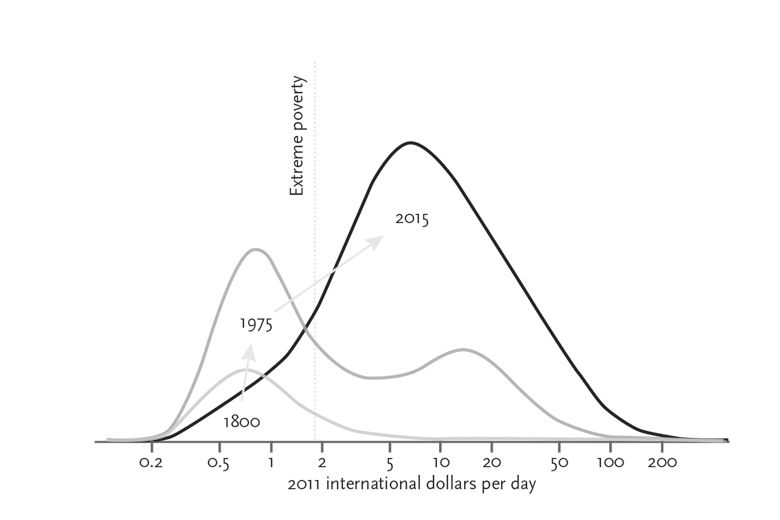
But, a much larger portion of Nigeria’s population lives on less than $2/day than the other two countries.
This isn’t a question of income, but of income distribution — a matter GDP per capita can’t fully address.
In a way, real GDP per capita is like a thermometer reading — it gives a quick look at temperature, but it doesn’t tell us everything.It’s far from the end-all, be-all of measuring our state of well-being. Still, it’s worth understanding how GDP per capita correlates to many of the other things we care about: our health, our happiness, and our education.
So join us in this video, as we work to understand how GDP per capita helps us measure a country’s standard of living. As we said: it’s not a perfect measure, but it is a useful one.
February 19, 2017
Nominal vs. Real GDP
Published on 19 Nov 2015
“Are you better off today than you were 4 years ago? What about 40 years ago?”
These sorts of questions invite a different kind of query: what exactly do we mean, when we say “better off?” And more importantly, how do we know if we’re better off or not?
To those questions, there’s one figure that can shed at least a partial light: real GDP.
In the previous video, you learned about how to compute GDP. But what you learned to compute was a very particular kind: the nominal GDP, which isn’t adjusted for inflation, and doesn’t account for increases in the population.
A lack of these controls produces a kind of mirage.
For example, compare the US nominal GDP in 1950. It was roughly $320 billion. Pretty good, right? Now compare that with 2015’s nominal GDP: over $17 trillion.
That’s 55 times bigger than in 1950!
But wait. Prices have also increased since 1950. A loaf of bread, which used to cost a dime, now costs a couple dollars. Think back to how GDP is computed. Do you see how price increases impact GDP?
When prices go up, nominal GDP might go up, even if there hasn’t been any real growth in the production of goods and services. Not to mention, the US population has also increased since 1950.
As we said before: without proper controls in place, even if you know how to compute for nominal GDP, all you get is a mirage.
So, how do you calculate real GDP? That’s what you’ll learn today.
In this video, we’ll walk you through the factors that go into the computation of real GDP.
We’ll show you how to distinguish between nominal GDP, which can balloon via rising prices, and real GDP—a figure built on the production of either more goods and services, or more valuable kinds of them. This way, you’ll learn to distinguish between inflation-driven GDP, and improvement-driven GDP.
Oh, and we’ll also show you a handy little tool named FRED — the Federal Reserve Economic Data website.
FRED will help you study how real GDP has changed over the years. It’ll show you what it looks like during healthy times, and during recessions. FRED will help you answer the question, “If prices hadn’t changed, how much would GDP truly have increased?”
FRED will also show you how to account for population, by helping you compute a key figure: real GDP per capita. Once you learn all this, not only will you see past the the nominal GDP-mirage, but you’ll also get an idea of how to answer our central question:
“Are we better off than we were all those years ago?”