
We economists marvel, too, but we also wonder how free apps fit into GDP. They do have their long-run downside, as we forget how to read maps and plot routes ourselves. (Anybody out there remember how to work a slide rule? No? That’s not a loss for computation but it does mean lower average numeracy.) But in the short run they save billions of hours in wrong turns not taken and trillions of cells of stomach lining no longer eaten up by travel anxiety. Not to mention their entertainment value.
But hardly any of that very big upside shows up in GDP. In one respect, in fact, GDP goes down. I used to buy maps, including travel atlases. I’m unlikely to do that anymore. Maps purchased by consumers are a “final good or service” and thus do enter into GDP. Maps I interact with online but don’t pay for aren’t GDP. So well-being has gone up — a lot — as a result of Google Maps. But GDP may well have gone down.
In fact, apps do produce some GDP. Google sustains itself in part by selling ads, including to retailers and restaurants looking to pay for prominent mention on its map display. Its ad revenue is an intermediate input into GDP. Many of the entities buying Google ads are in the business of selling “final goods or services” and if they’re money-making, the prices of their goods have to cover the cost of their ads. So by that circuitous route the “value” of the apps does end up in GDP.
But what’s the relationship between what advertisers pay for my eyeballs and the value of the app to me? The two are not completely unrelated. The more I use the app the more I’m likely to buy the advertised products, presumably. But in practice, the probability of my buying is pretty small while my benefit from the app is pretty big. How strange that miracle apps can change our lives but not our GDP.
William Watson, “How using Google Maps on your summer road trip messes with the GDP”, Financial Post, 2017-07-18.
August 3, 2017
QotD: Improved quality of life doesn’t always show up in GDP figures
April 15, 2017
Charles Joseph Minard
I first encountered Charles Joseph Minard’s best-known work in Edward Tufte’s The Visual Display of Quantitative Information in the late 1980s:
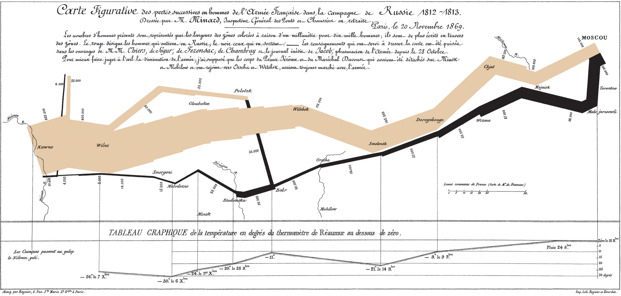
The map’s French caption reads:
Figurative Map of the successive losses in men of the French Army in the Russian campaign 1812-1813.
Drawn up by M. Minard, Inspector General of Bridges and Roads in retirement. Paris, November 20, 1869.
The numbers of men present are represented by the widths of the colored zones at a rate of one millimeter for every ten-thousand men; they are further written across the zones. The red [now brown] designates the men who enter into Russia, the black those who leave it. —— The information which has served to draw up the map has been extracted from the works of M. M. Thiers, of Segur, of Fezensac, of Chambray, and the unpublished diary of Jacob, pharmacist of the army since October 28th. In order to better judge with the eye the diminution of the army, I have assumed that the troops of prince Jerome and of Marshal Davoush who had been detached at Minsk and Moghilev and have rejoined around Orcha and Vitebsk, had always marched with the army.
The scale is shown on the center-right, in “lieues communes de France” (common French league) which is 4,444m (2.75 miles).
The lower portion of the graph is to be read from right to left. It shows the temperature on the army’s return from Russia, in degrees below freezing on the Réaumur scale. (Multiply Réaumur temperatures by 1¼ to get Celsius, e.g. −30°R = −37.5 °C) At Smolensk, the temperature was −21° Réaumur on November 14th.
(Image and translation from Wikimedia)
In National Geographic, Betsy Mason reveals more about the man who created the “best graphic ever produced”:
Charles Joseph Minard’s name is synonymous with an outstanding 1869 graphic depicting the horrific loss of life that Napoleon’s army suffered in 1812 and 1813, during its invasion of Russia and subsequent retreat. The graphic (below), which is often referred to simply as “Napoleon’s March” or “the Minard graphic,” rose to its prominent position in the pantheon of data visualizations largely thanks to praise from one of the field’s modern giants, Edward Tufte. In his 1983 classic text, The Visual Display of Quantitative Information, Tufte declared that Napoleon’s March “may well be the best statistical graphic ever produced.”
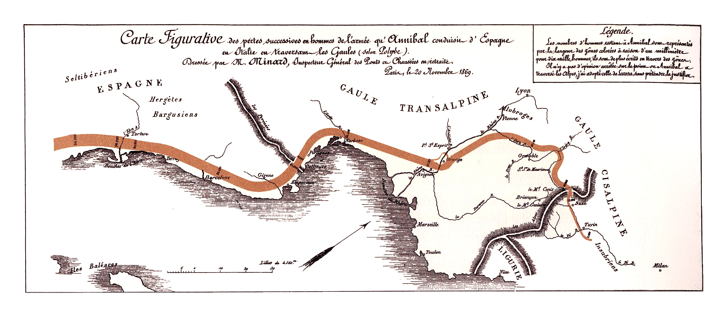
Today Minard is revered in the data-visualization world, commonly mentioned alongside other greats such as John Snow, Florence Nightingale, and William Playfair. But Minard’s legacy has been almost completely dominated by his best-known work. In fact, it may be more accurate to say that Napoleon’s March is his only widely known work. Many fans of the March have likely never even seen the graphic that Minard originally paired it with: a visualization of Hannibal’s famous military campaign in 218 BC, as seen in the image below.
Graphic information of the men losses in the raid of the troops of Hannibal from Spain to Italy (Wikimedia)
On its face, it may not seem remarkable that Minard is remembered for this one piece of work; after all, many people owe their fame to a single great achievement, and the Napoleon graphic is certainly worthy of its reputation. But Minard was most definitely not a one-hit wonder.
March 29, 2017
You can’t really understand history without considering the geography
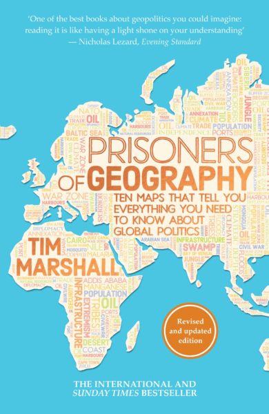
At Samizdata, Brian Micklethwait discusses Tim Marshall’s book, Prisoners of Geography:
Britain and Western Europe, and then the other parts of the world where English is the dominant language, have mostly been blessed with a degree of geographically conferred freedom of manoeuvre that is denied to the inhabitants of pretty much all other nations. That is why these places got rich first. And it also now means that we Euros and Anglos are able to believe, as a matter of practical political policy rather than merely as privately pious aspiration, in a wide range of idealistic things of very variable value – things like freedom, democracy, equality, human rights, freedom for women, “social justice”. and so on and so forth – things that geographically more constrained people can only, as yet, dream of, and which they often regard as more as a threat to their own ways of doing things than as any kind of promise.
[…]
The word “maps” being in its subtitle, along with the bombastic claim that these maps tell you all you need to know about the world, these maps ought to be really, really well done, from the graphic point of view. But to my admittedly fading eye, they seemed to be not that good. On their own, they tell you nothing like everything about the world, which is why you actually need to read the book to get the points of all the maps. I was particularly disappointed by how the mountains look in these maps. Along with rivers, mountains are a big deal in this book, as you would expect them to be. But, in these maps, the mountains often scarcely register. It doesn’t help that the maps are done only with black ink on white paper. Colour would have helped. But even black ink could have been used, I feel, with somewhat greater clarity. I had to look quite hard to work out where these various mountains were. But, as I say, maybe that’s just me. My eyesight is definitely not what it was.
The mountainous insight I recall with particular pleasure is Marshall’s observation that the hostility between India and China would have been and would now be far greater, were it not for the most impenetrably formidable mountains on earth being at the boundary between these two civilisations. Contrast those impenetrable Asian mountains with that famous gap in the mountains in northern Europe, which results in a gigantic military parade ground with no natural barriers stretching from the Pyrenees to the Urals.
In addition to knowing better about Europe’s mountains, I now sort of know a whole lot more than I did about the mountains of South America. South America is, for me, one of the less fascinating places in the world, because, being so geographically cut off from the rest of the world and being of significance mostly only to their northern neighbours, South American mistakes count for a lot less than mistakes can elsewhere, especially mistakes made by the USA and Europe of course. South America, you might say, is basically just a big clutch of European mistakes.
Speaking of European mistakes, Marshall is very good on the habit of late nineteenth century Europeans of drawing straight lines upon maps of foreign parts, in defiance of geographical and consequent social and cultural and now “national” realities on the ground. The USA gets along fine despite all the straight lines that it contains dividing its states, because these states are, fundamentally, still very united, at least in the sense that everyone in them is quarrelling about the same things within the same political institutions. But the Middle East is still trying to shake free of its baleful legacy of fake states, which Europeans and now also Americans, all motivated by the need for oil, have expended so much of their own treasure and so much Middle Eastern blood trying to keep in being.
December 6, 2016
Bowmanville, Ontario from 1984-2016 in Google Timelapse
Description from the Timelapse page:
Timelapse
Timelapse is a global, zoomable video that lets you see how the Earth has changed over the past 32 years. It is made from 33 cloud-free annual mosaics, one for each year from 1984 to 2016, which are made interactively explorable by Carnegie Mellon University CREATE Lab’s Time Machine library, a technology for creating and viewing zoomable and pannable timelapses over space and time.
Using Earth Engine, we combined over 5 million satellite images acquired over the past three decades by 5 different satellites. The majority of the images come from Landsat, a joint USGS/NASA Earth observation program that has observed the Earth since the 1970s. For 2015 and 2016, we combined Landsat 8 imagery with imagery from Sentinel-2A, part of the European Commission and European Space Agency’s Copernicus Earth observation program.
December 6, 2015
The American Civil War: Every Day
Published on 31 Oct 2014
See every day of the American Civil War unfold as the Union fights against the Confederacy to reunite the country in a bitter struggle.
Legend:
Maroon = Confederate States of America and territories
Red = Areas occupied by Confederate forces
Pink = Gains for that Day
Dark Blue = United States of America and territories
Blue = Areas occupied by Union forces.
Light blue = Gains for that day
Yellow = Border states / disputed areas.
H/T to BoingBoing for the link.
November 24, 2015
The Mercator Puzzle
How badly distorted is your mental map of the world thanks to the use of the Mercator projection? You can test yourself right here in your web browser with The Mercator Puzzle. Click on the image below, then drag each distorted country outline to its correct location on the underlying map:
Click to play in your browser
H/T to Laura Hudson for the link.
September 7, 2015
February 14, 2015
Europe in 1899, according to Fred W. Rose
Before the modern age of the infographic, artists like Fred W. Rose still had their own idiosyncratic ways to present as much information as they could for a wider audience:

H/T to Tam for the link.
November 23, 2014
The odd names of Britain – now available as a wall map
Like most denizens of North America, I’ve sometimes stumbled upon odd village names in Britain. There are some weird and daffy names still in use in the UK and you can now get a wall map highlighting a large number of them:
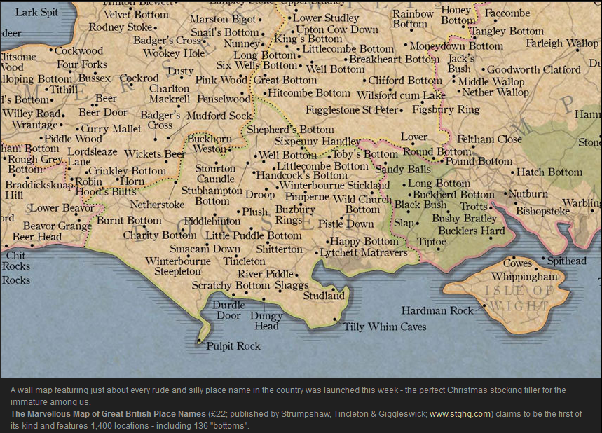
H/T to Jessica Brisbane for the link.
November 9, 2014
A Viking view of Europe, circa 1000AD
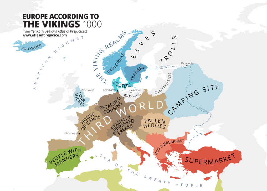
Europe According to the Vikings (1000) from Atlas of Prejudice 2 by Yanko Tsvetkov.
H/T to Never Yet Melted for the link.
September 24, 2014
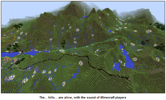
Britain is big on Minecraft
Er, sorry, I mis-spoke there … Britain is big in Minecraft:
Blighty’s Ordnance Survey organisation has updated the country’s map in Minecraft, adding roads, national rail networks and houses to the digital overview.
A plucky intern at the mapping org stuck Britain into the vastly popular game this time last year. Now that he’s bagged himself a full-time position on the grad scheme, Joseph Braybrook decided to add 83 billion bricks to the map, which is now so detailed that folks can find their houses on it.
“The terrain has been doubled in scale to provide more detail. It uses 1:25 000 scale OS VectorMap District to give a smoother, more expansive appearance that is closer to real life,” Braybrook explained.
“The water features now appear in sharper detail, too, so you can see individual streams and tributaries coming off rivers. The forests and woodlands are now populated with generated trees, and the national rail network has been added. I’m looking forward to seeing if people eventually build a working railway system in game,” he added.
June 29, 2014
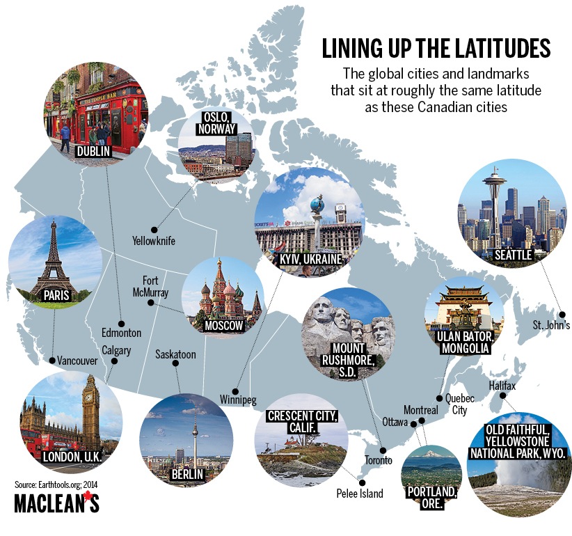
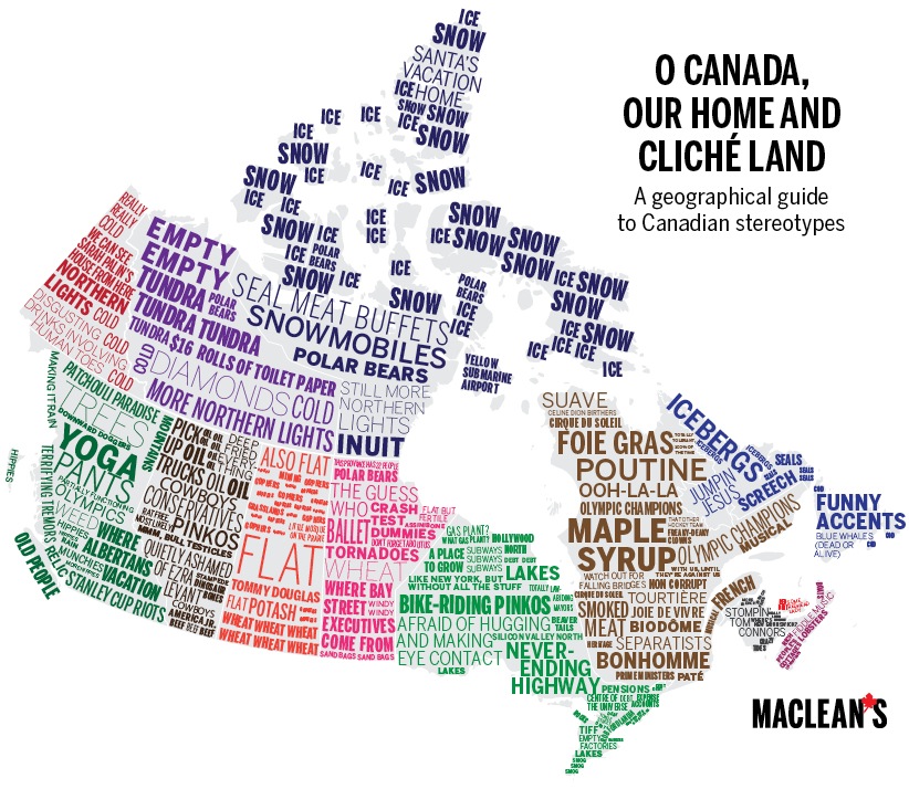
Maclean’s puts Canada on the map, sorta
For Canada Day, Maclean’s tries portraying the country in various different ways:
Happy Canada Day! For a different perspective on the country this year, Maclean’s went to the maps. Drawing on a variety of sources, from government statistics to various online databases to tweets, here are some maps to illustrate Canada as you’ve never seen it before.
[…]
It’s always a surprise when people first learn that the very tip of southwestern Ontario is at a lower latitude than parts of California — which got us wondering: How do other parts of the country line up with the rest of the world? Here are the results, using Earthtools.org. Most of the cities on this map, and their global counterparts, lie within less than 50 km of each other, latitudinally speaking, of course. Only Quebec-Ulan Bator and Fort McMurray-Moscow are a full degree apart.
[…]
What to say? Canada is a land of contrasts. It also offers up a bounty of clichés.
April 8, 2014
Map of the day
Here’s an interesting map. What do you think it shows? An epidemic? Outbreaks of zombies? Incidents of flashmobbing?

Click to see full-sized image at the Washington Post
The real answer is this shows where participants in an American survey plotted the location of Ukraine. The headline of the story is “The less Americans know about Ukraine’s location, the more they want U.S. to intervene“.
Where’s Ukraine? Each dot depicts the location where a U.S. survey respondent situated Ukraine; the dots are colored based on how far removed they are from the actual country, with the most accurate responses in red and the least accurate ones in blue. (Data: Survey Sampling International; Figure: Thomas Zeitzoff/The Monkey Cage)
I’m not sure which responses worry me the most: the ones that show Ukraine in “flyover country”, Alaska, or Greenland or those that show Ukraine as an underwater modern-day Atlantis…
Update 10 April: I’m kicking myself for forgetting this Bierce quote.
Seems like that @monkeycageblog post on Ukraine should have brought up Ambrose Bierce: "War is God's way of teaching Americans geography."
— Justin Logan (@JustinTLogan) April 10, 2014
April 2, 2014
Mapaholics rejoice!
The New York Public Library has released over 20,000 historical maps under a Creative Commons license:
Lionel Pincus & Princess Firyal Map Division is very proud to announce the release of more than 20,000 cartographic works as high resolution downloads. We believe these maps have no known US copyright restrictions.* To the extent that some jurisdictions grant NYPL an additional copyright in the digital reproductions of these maps, NYPL is distributing these images under a Creative Commons CC0 1.0 Universal Public Domain Dedication. The maps can be viewed through the New York Public Library’s Digital Collections page, and downloaded (!), through the Map Warper. First, create an account, then click a map title and go. […]
What’s this all mean?
It means you can have the maps, all of them if you want, for free, in high resolution. We’ve scanned them to enable their use in the broadest possible ways by the largest number of people.
Though not required, if you’d like to credit the New York Public Library, please use the following text “From The Lionel Pincus & Princess Firyal Map Division, The New York Public Library.” Doing so helps us track what happens when we release collections like this to the public for free under really relaxed and open terms. We believe our collections inspire all kinds of creativity, innovation and discovery, things the NYPL holds very dear.
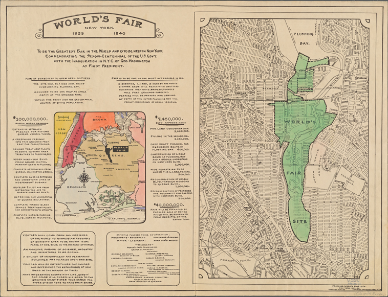
World’s Fair New York 1939-1940. Proposed World’s Fair site.
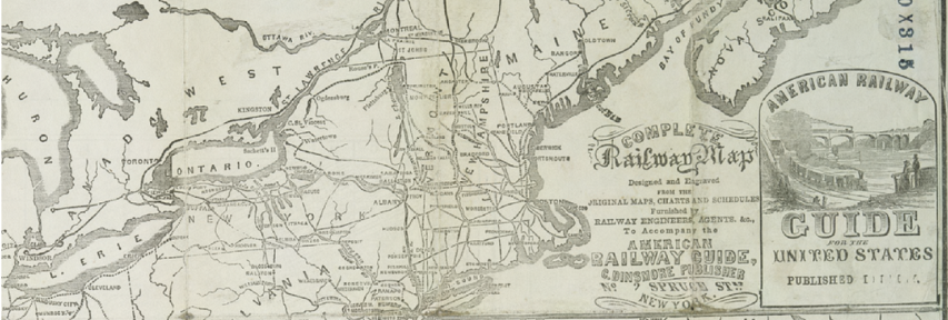
Complete railway map designed and engraved from the original maps, charts and schedules furnished by railway engineers, agents &c. to accompany the American Railway Guide (detail)
October 19, 2013
Amusing maps – US population distribution in units of Canadas
You can find the most interesting things on Twitter. Here’s @Amazing_Maps with a map of the United States divided up into units of Canadas:
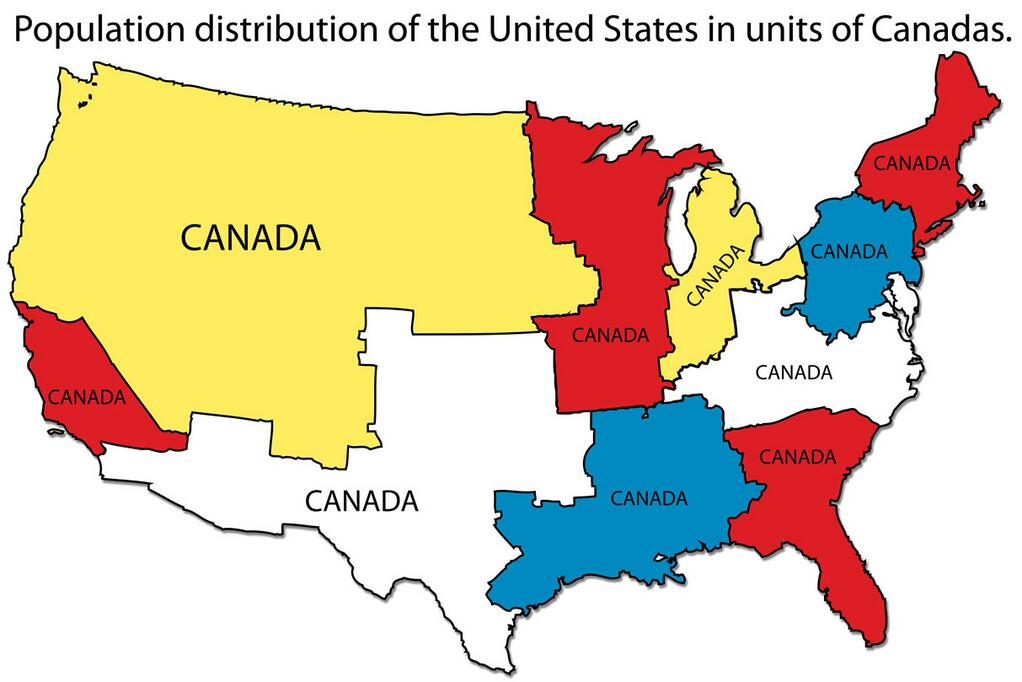
Click to embiggenate