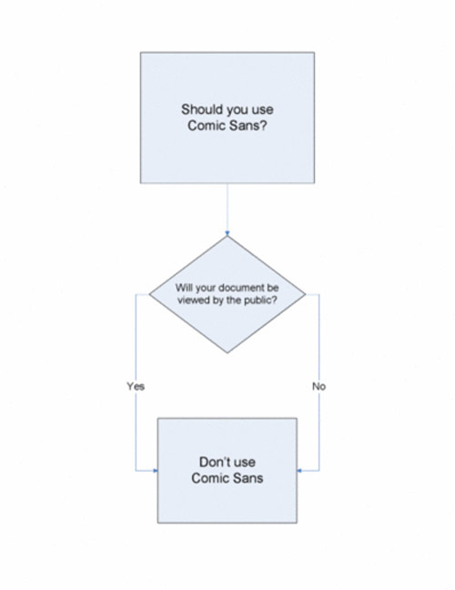
How geeky do you have to be to find this sort of thing funny as hell?

H/T to Eric S. Raymond for the link.

How geeky do you have to be to find this sort of thing funny as hell?

H/T to Eric S. Raymond for the link.
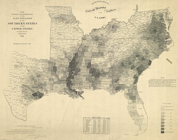
A fascinating NYT post looks at one of the most influential maps of the US Civil War period:

The 1860 Census was the last time the federal government took a count of the South’s vast slave population. Several months later, the United States Coast Survey — arguably the most important scientific agency in the nation at the time — issued two maps of slavery that drew on the Census data, the first of Virginia and the second of Southern states as a whole. Though many Americans knew that dependence on slave labor varied throughout the South, these maps uniquely captured the complexity of the institution and struck a chord with a public hungry for information about the rebellion.
The map uses what was then a new technique in statistical cartography: Each county not only displays its slave population numerically, but is shaded (the darker the shading, the higher the number of slaves) to visualize the concentration of slavery across the region. The counties along the Mississippi River and in coastal South Carolina are almost black, while Kentucky and the Appalachians are nearly white.
H/T to Walter Olson for the link.
Powered by WordPress