Scott Alexander on the irritating advance of meaningless flashing elements on so many web pages where they serve no real purpose, but successfully generate anger in their users:
Everyone hates flashing banner ads, but maybe they’re a necessary evil. Creators want money, advertisers demand a certain level of visibility for their ad buys, maybe sites are willing to eat the cost in user goodwill. Fine. But what’s everyone else’s excuse?
A few days ago I needed to look up an obscure point of Jewish law, as you do, and found this Jewish law website:
The background toggles every few seconds between a picture of a rabbi and a picture of … a different rabbi? There’s no conceivable benefit to this and it makes it almost impossible to concentrate on the text.
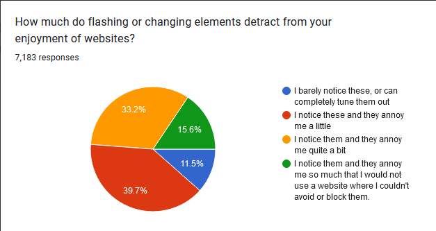
I used to think I must be the only person who worried about this; maybe it was a weird OCD thing. But I asked about it on the ACX survey …
… and 88% of people find them at least a little annoying! 16% of people go all the way, and say they wouldn’t use a website that has them!
Yet websites have been adding them to more and more parts of the user experience. Most aren’t as blatant as the Jewish law site, but they’re still there.


