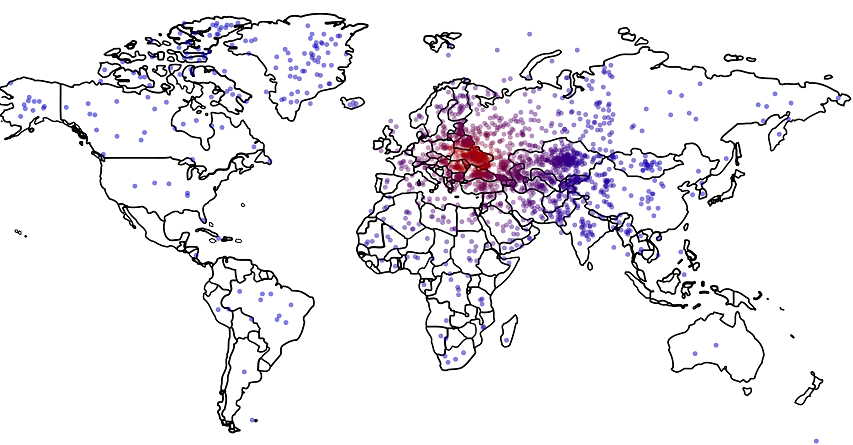
Here’s an interesting map. What do you think it shows? An epidemic? Outbreaks of zombies? Incidents of flashmobbing?
The real answer is this shows where participants in an American survey plotted the location of Ukraine. The headline of the story is “The less Americans know about Ukraine’s location, the more they want U.S. to intervene“.
Where’s Ukraine? Each dot depicts the location where a U.S. survey respondent situated Ukraine; the dots are colored based on how far removed they are from the actual country, with the most accurate responses in red and the least accurate ones in blue. (Data: Survey Sampling International; Figure: Thomas Zeitzoff/The Monkey Cage)
I’m not sure which responses worry me the most: the ones that show Ukraine in “flyover country”, Alaska, or Greenland or those that show Ukraine as an underwater modern-day Atlantis…
Update 10 April: I’m kicking myself for forgetting this Bierce quote.
Seems like that @monkeycageblog post on Ukraine should have brought up Ambrose Bierce: "War is God's way of teaching Americans geography."
— Justin Logan (@JustinTLogan) April 10, 2014


