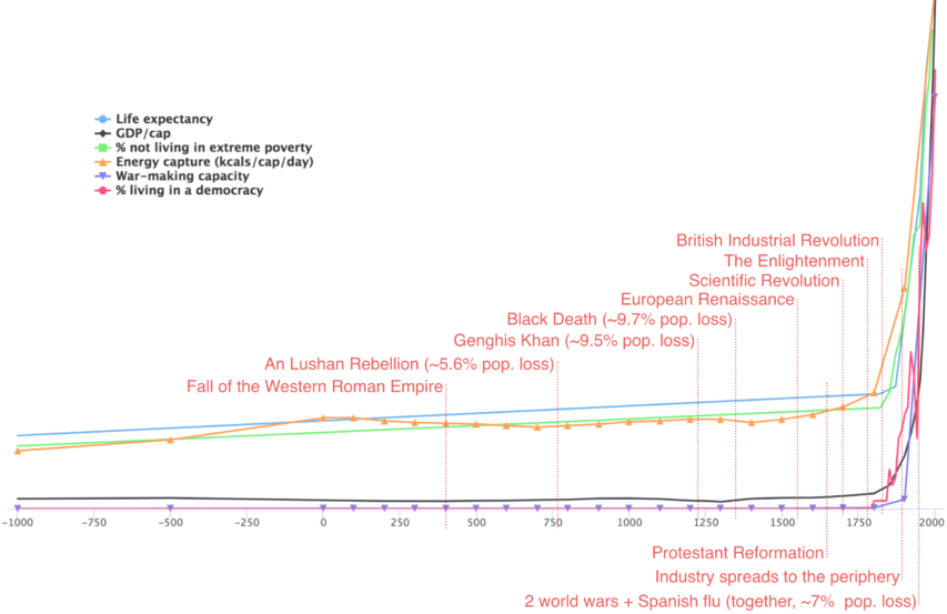
Steve Kates linked to this post at Luke Muehlhauser’s blog, showing another graph with a hockey stick pattern, but it isn’t one of the IPCC’s misleading bits of propaganda:
In How big a deal was the Industrial Revolution?, I looked for measures (or proxy measures) of human well-being / empowerment for which we have “decent” scholarly estimates of the global average going back thousands of years. For reasons elaborated at some length in the full report, I ended up going with:
- Physical health, as measured by life expectancy at birth.
- Economic well-being, as measured by GDP per capita (PPP) and percent of people living in extreme poverty.
- Energy capture, in kilocalories per person per day.
- Technological empowerment, as measured by war-making capacity.
- Political freedom to live the kind of life one wants to live, as measured by percent of people living in a democracy.
- (I also especially wanted measures of subjective well-being and social well-being, and also of political freedom as measured by global rates of slavery, but these data aren’t available; see the report.)
Anyway, the punchline of the report is that when you chart these six measures over the past few millennia (data; zoomable), you get a chart like this (axes removed for space reasons):
(And yes, there’s still a sharp jump around 1800-1870 if you chart this on a log scale.)
Basically, if I help myself to the common (but certainly debatable) assumption that “the industrial revolution” is the primary cause of the dramatic trajectory change in human welfare around 1800-1870, then my one-sentence summary of recorded human history is this:
Everything was awful for a very long time, and then the industrial revolution happened.


