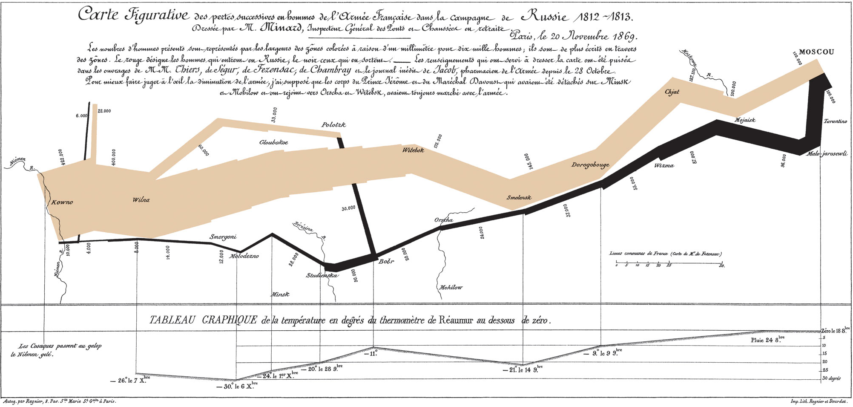
I first encountered Charles Joseph Minard’s best-known work in Edward Tufte’s The Visual Display of Quantitative Information in the late 1980s:

The map’s French caption reads:
Figurative Map of the successive losses in men of the French Army in the Russian campaign 1812-1813.
Drawn up by M. Minard, Inspector General of Bridges and Roads in retirement. Paris, November 20, 1869.
The numbers of men present are represented by the widths of the colored zones at a rate of one millimeter for every ten-thousand men; they are further written across the zones. The red [now brown] designates the men who enter into Russia, the black those who leave it. —— The information which has served to draw up the map has been extracted from the works of M. M. Thiers, of Segur, of Fezensac, of Chambray, and the unpublished diary of Jacob, pharmacist of the army since October 28th. In order to better judge with the eye the diminution of the army, I have assumed that the troops of prince Jerome and of Marshal Davoush who had been detached at Minsk and Moghilev and have rejoined around Orcha and Vitebsk, had always marched with the army.
The scale is shown on the center-right, in “lieues communes de France” (common French league) which is 4,444m (2.75 miles).
The lower portion of the graph is to be read from right to left. It shows the temperature on the army’s return from Russia, in degrees below freezing on the Réaumur scale. (Multiply Réaumur temperatures by 1¼ to get Celsius, e.g. −30°R = −37.5 °C) At Smolensk, the temperature was −21° Réaumur on November 14th.
(Image and translation from Wikimedia)
In National Geographic, Betsy Mason reveals more about the man who created the “best graphic ever produced”:
Charles Joseph Minard’s name is synonymous with an outstanding 1869 graphic depicting the horrific loss of life that Napoleon’s army suffered in 1812 and 1813, during its invasion of Russia and subsequent retreat. The graphic (below), which is often referred to simply as “Napoleon’s March” or “the Minard graphic,” rose to its prominent position in the pantheon of data visualizations largely thanks to praise from one of the field’s modern giants, Edward Tufte. In his 1983 classic text, The Visual Display of Quantitative Information, Tufte declared that Napoleon’s March “may well be the best statistical graphic ever produced.”
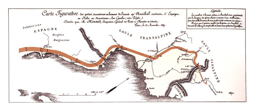
Today Minard is revered in the data-visualization world, commonly mentioned alongside other greats such as John Snow, Florence Nightingale, and William Playfair. But Minard’s legacy has been almost completely dominated by his best-known work. In fact, it may be more accurate to say that Napoleon’s March is his only widely known work. Many fans of the March have likely never even seen the graphic that Minard originally paired it with: a visualization of Hannibal’s famous military campaign in 218 BC, as seen in the image below.
Graphic information of the men losses in the raid of the troops of Hannibal from Spain to Italy (Wikimedia)
On its face, it may not seem remarkable that Minard is remembered for this one piece of work; after all, many people owe their fame to a single great achievement, and the Napoleon graphic is certainly worthy of its reputation. But Minard was most definitely not a one-hit wonder.


