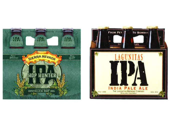
At Techdirt, Timothy Geigner explains why a recent trademark action was (sensibly) dropped:
Here we almost went again. The craft beer space was known for quite a while for its congenial attitude when it came to competitors. That seems to have shifted a bit in the past few years, with all kinds of silly intellectual property disputes arising among breweries. Trademark claims seem to be the issue du jour, not surprisingly, though you’d think with the common public response being backlash this trend would have ceased already. It seems the lesson still needs to be taught, however, even amongst some of the larger craft breweries with some of the best reputations. Lagunitas, for instance, which likes to bill itself as the hip and laid-back beer for the NPR crowd (yes, over-simplifying), saw fit to sue competitor Sierra Nevada over trade dress issues until the public reacted and they quickly backed away.
In a suit filed Monday in U.S. District Court, Lagunitas owner Tony Magee argued Sierra Nevada’s design for its Hop Hunter India Pale Ale — which features “IPA” in large, bold, black capital letters — is too similar to the design for his Lagunitas IPA label.
And here are the labels in question.
Both, as you can see, feature the letters “IPA”, for India Pale Ale, in a bold font that has some degree of similarity. As you’ll also see, assuming you aren’t a blind wombat that’s been dipping into the barley wine for twenty straight hours, both brewery’s names are super-evident on the label, the color scheme is uber-different, the rest of the label isn’t remotely the same, and oh my god, why do we have to keep doing this? The likelihood of customer confusion here is roughly the same as the likelihood that I’m about to sprout wings, horns, and enslave humanity under my forked tongue. I mean, sure, it might happen, but then we all have bigger problems, don’t you think?


