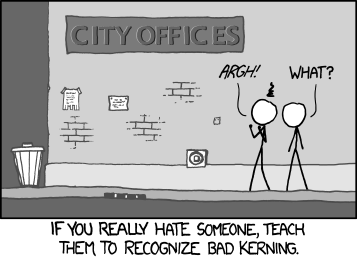
Seth Godin offers a simple guide to typography for non-fontheads:
Setting type used to have just one function: is it readable? Then, to save money, a new question: Can we get a lot of words on a page?
The third question, though, is the most dominant for most people making a presentation, designing a website, scoping out a logo or otherwise using type to deliver a message: How does it look?
The answer is not absolute. In some situations, some cultures, some usages, one type looks fine and another looks garish or silly or just wrong. And the reason is that whether we realize it or not, type reminds us of something we’ve seen before.
[. . .]
Here’s the amateur’s rule of thumb: don’t call attention to your typeface choices unless you want the typeface to speak for you. Instead, start with the look and feel of the industry leaders and go from there. The shortcut that I learned from design pioneer (and the world’s first desktop publisher) John McWade: Use Franklin Gothic Condensed for your headlines and Garamond for your body copy. Change it if you want, but only when you want to remind me of something.
He also links to this highly appropriate xkcd comic:


