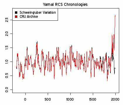
The red line in the following graph should be familiar to you, if you’ve been following the Global Warming/Climate Change debate:
The trick here is the black line:
A comparison of Yamal RCS chronologies. red — as archived with 12 picked cores; black — including Schweingruber’s Khadyta River, Yamal (russ035w) archive and excluding 12 picked cores. Both smoothed with 21-year gaussian smooth. y-axis is in dimensionless chronology units centered on 1 (as are subsequent graphs (but represent age-adjusted ring width).
The “blade” of the hockey stick was a data artifact of the careful selection of only twelve samples. Including a wider sample produces a very different picture, as you can see above.


[…] instead, be the argument that doing anything to limit global warming would destroy the economy. A broken hockey stick graph – quotulatiousness.ca 09/29/2009 The red line in the following graph should be familiar to you, if […]
Pingback by COACHEP » Blog Archive » Posts about Junk Science as of September 29, 2009 — September 30, 2009 @ 01:44
[…] the “do something now” faction has been the famous Hockey Stick Graph, which has been debunked. The data was carefully selected to support pre-decided conclusions. Everyone who took high school […]
Pingback by More background on that broken hockey stick « Quotulatiousness — September 30, 2009 @ 09:53