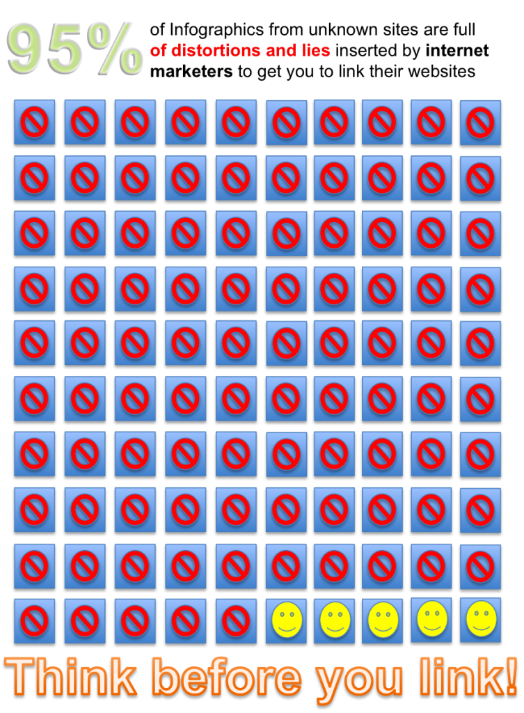
Megan McArdle’s year-end plea to stop the Infographic Plague:

If you look at these lovely, lying infographics, you will notice that they tend to have a few things in common:
- They are made by random sites without particularly obvious connection to the subject matter. Why is Creditloan.com making an infographic about the hourly workweek?
- Those sites, when examined, either have virtually no content at all, or are for things like debt consolidation — industries with low reputation where brand recognition, if it exists at all, is probably mostly negative.
- The sources for the data, if they are provided at all, tend to be in very small type at the bottom of the graphic, and instead of easy-to-type names of reports, they provide hard-to-type URLs which basically defeat all but the most determined checkers.
- The infographics tend to suggest that SOMETHING TERRIBLE IS HAPPENING IN THE US RIGHT NOW!!! the better to trigger your panic button and get you to spread the bad news BEFORE IT’S TOO LATE!
The infographics are being used to get unwitting bloggers to drive up their google search rankings. When they get a link from Forbes, or a blogger like Andrew Sullivan — who is like Patient Zero for many of these infographics — Google thinks they must be providing valuable information. Infographics are so good at getting this kind of attention that web marketing people spend a lot of time writing articles about how you can use them to boost your SEO (search engine optimization).


