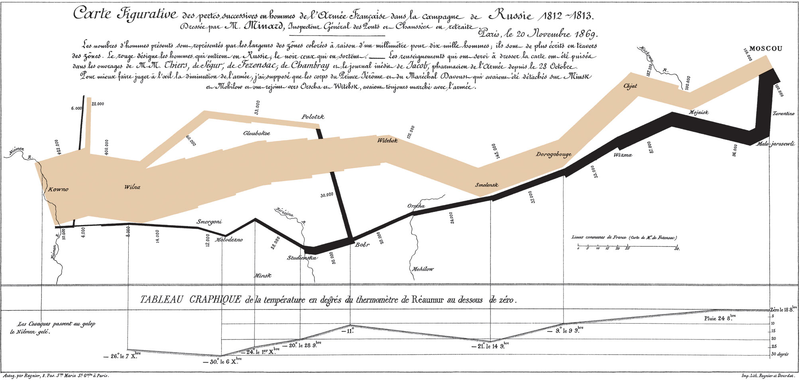
Do you remember seeing the amazingly informative diagram by Charles Joseph Minard on the statistical side of Napoleon’s disastrous march on Moscow:

Charles Joseph Minard’s famous graph showing the decreasing size of the Grande Armée as it marches to Moscow (brown line, from left to right) and back (black line, from right to left) with the size of the army equal to the width of the line. Temperature is plotted on the lower graph for the return journey (Multiply Réaumur temperatures by 1¼ to get Celsius, e.g. −30 °R = −37.5 °C)
That is what a really good infographic can be. But, as Tim Harford points out, they’re not all that good:
Camouflage usually means blending in. That wasn’t an option for the submarine-dodging battleships of a century ago, which advertised their presence against an ever-changing sea and sky with bow waves and smokestacks. And so dazzle camouflage was born, an abstract riot of squiggles and harlequin patterns. It wasn’t hard to spot a dazzle ship but the challenge for the periscope operator was quickly to judge a ship’s speed and direction before firing a torpedo on a ponderous intercept. Dazzle camouflage was intended to provoke misjudgments, and there is some evidence that it worked.
Now let’s talk about data visualisation, the latest fashion in numerate journalism, albeit one that harks back to the likes of Florence Nightingale. She was not only the most famous nurse in history but the creator of a beautiful visualisation technique, the “Coxcomb diagram”, and the first woman to be elected as a member of the Royal Statistical Society.
Data visualisation creates powerful, elegant images from complex data. It’s like good prose: a pleasure to experience and a force for good in the right hands, but also seductive and potentially deceptive. Because we have less experience of data visualisation than of rhetoric, we are naive, and allow ourselves to be dazzled. Too much data visualisation is the statistical equivalent of dazzle camouflage: striking looks grab our attention but either fail to convey useful information or actively misdirect us.
[. . .]
Those beautiful Coxcomb diagrams are no exception. They show the causes of mortality in the Crimean war, and make a powerful case that better hygiene saved lives. But Hugh Small, a biographer of Nightingale, argues that she chose the Coxcomb diagram in order to make exactly this case. A simple bar chart would have been clearer: too clear for Nightingale’s purposes, because it suggested that winter was as much of a killer as poor hygiene was. Nightingale’s presentation of data was masterful. It was also designed not to inform but to persuade. When we look at modern data visualisations, we should remember that.


