Quotulatiousness

August 16, 2018

In praise of Donald Knuth

Filed under: Books, History, Technology — Tags: , — Nicholas @ 03:00

David Warren sings the praises of the inventor of “TeX”:

Among my heroes in that trade is a man now octogenarian, a certain Donald Knuth, author of the multi-volumed Art of Computer Programming, and of the great mass of algorithms behind the “TeX” composing system. A life-long opponent of patenting for software, and still not on email, he is one of the finer products of the Whole Earth Catalogue mindset of that era, though as a devoted Christian, he had it from older sources. (The mindset of: forget politics and do-it-yerself.)

Perfesser Knuth’s life journey was somewhat altered when a publisher presented him with the galley proofs for a reissue of one of his earlier volumes. They were, compared to the pages of the original hot-metal edition, a dog’s breakfast. In particular, even when technically correct, the mathematical formulae appeared to have been set by monkeys. He resolved to “make the world a better place” by doing something about this.

Knowing (pronounce the “k” as we do in this author’s surname) that computers can do many things that humans can’t — or can’t within one lifetime — he set about designing the computer processes to calculate beautiful letter and word spacings, line-breaks, line spacings, marginal proportions and such. He understood that civilization depends on literacy, literacy on legibility, and legibility on elegance. Ruthlessly, he recognized that things like “widowed” and “orphaned” lines of text are moral evils, and discovered algorithms that could exterminate them by complex anticipation. Too, he contributed to the counter-revolution by which the letters themselves could be drawn not pixelated.

I will quickly lose my few remaining readers if I go into the details. But here was a man (and still is) who discerned that nature herself is built on aesthetic principles, which men can investigate and apply. It is when something is ugly that we can know that it is wrong. Mathematicians, like poets and other artists, can embody the Faith at the root of this.

To my mind, or I would rather say K-nowledge, there is nothing wrong with technology, per se. We can often do things better with new tools. But we must be guided by the uncompromising demands of Beauty. Everything must be made as beautiful as we can make it: there must be no wavering, no surrender. All that is ugly must be consigned to Hell.

May 5, 2013

If you pay too much attention to fonts, you will surely go mad

Filed under: Media — Tags: — Nicholas @ 10:02

Seth Godin offers a simple guide to typography for non-fontheads:

Setting type used to have just one function: is it readable? Then, to save money, a new question: Can we get a lot of words on a page?

The third question, though, is the most dominant for most people making a presentation, designing a website, scoping out a logo or otherwise using type to deliver a message: How does it look?

The answer is not absolute. In some situations, some cultures, some usages, one type looks fine and another looks garish or silly or just wrong. And the reason is that whether we realize it or not, type reminds us of something we’ve seen before.

[. . .]

Here’s the amateur’s rule of thumb: don’t call attention to your typeface choices unless you want the typeface to speak for you. Instead, start with the look and feel of the industry leaders and go from there. The shortcut that I learned from design pioneer (and the world’s first desktop publisher) John McWade: Use Franklin Gothic Condensed for your headlines and Garamond for your body copy. Change it if you want, but only when you want to remind me of something.

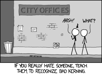
He also links to this highly appropriate xkcd comic:

I have never been as self-conscious about my handwriting as when I was inking in the caption for this comic.

June 2, 2011

Pity the poor, over-used em-dash

Filed under: Media, Randomness — Tags: , , , , — Nicholas @ 09:39

Noreen Malone — who admits to being an em-dash abuser herself — makes an appeal for everyone to just leave the em-dash alone!

According to the Associated Press StylebookSlate‘s bible for all things punctuation- and grammar-related — there are two main prose uses— the abrupt change and the series within a phrase — for the em dash. The guide does not explicitly say that writers can use the dash in lieu of properly crafting sentences, or instead of a comma or a parenthetical or a colon — and yet in practical usage, we do. A lot — or so I have observed lately. America’s finest prose — in blogs, magazines, newspapers, or novels — is littered with so many dashes among the dots it’s as if the language is signaling distress in Morse code.

What’s the matter with an em dash or two, you ask? — or so I like to imagine. What’s not to like about a sentence that explores in full all the punctuational options — sometimes a dash, sometimes an ellipsis, sometimes a nice semicolon at just the right moment — in order to seem more complex and syntactically interesting, to reach its full potential? Doesn’t a dash — if done right — let the writer maintain an elegant, sinewy flow to her sentences?

Nope — or that’s my take, anyway. Now, I’m the first to admit — before you Google and shame me with a thousand examples in the comments — that I’m no saint when it comes to the em dash. I never met a sentence I didn’t want to make just a bit longer — and so the dash is my embarrassing best friend. When the New York Times‘ associate managing editor for standards — Philip B. Corbett, for the record — wrote a blog post scolding Times writers for overusing the dash (as many as five dashes snuck their way into a single 3.5-paragraph story on A1, to his horror), an old friend from my college newspaper emailed it to me. “Reminded me of our battles over long dashes,” he wrote — and, to tell the truth, I wasn’t on the anti-dash side back then. But as I’ve read and written more in the ensuing years, my reliance on the dash has come to feel like a pack-a-day cigarette habit — I know it makes me look and sound and feel terrible — and so I’m trying to quit.

Bloggers (some of us, anyway) tend to use the em-dash a bit too frequently, and that’s one of the downsides to being one-person shows — there’s no kindly editor to strike through the excess punctuation with a red pen.

May 18, 2011

If you take typography seriously, you will surely go mad

Filed under: Humour, Technology — Tags: , , — Nicholas @ 15:51

Frequent commenter Lickmuffin sent in this link with the subject line “This is amusing AND SPOT ON!”.

This is freaking me out today. You see, I hardly look at my calendar date on the iPhone. But today I did. I looked at that pixel-perfect, beautiful Retina screen and this problem got instantly into my eye, like a white hot scalpel pinching through my retina until it reached the back of my skull.

See what I mean? Can you see IT? The 1 is off center. Instead of being optically centered, it’s geometrically centered. So it just looks wrong. Really, what happened there, Steve? Where did all that love for typography and attention to detail go? Out the fucking window of your silver Merc, that’s where.

Perhaps this is some kind of cruel April Fools joke from Cupertino. Maybe they are all at the office, hahahing at their clever joke. OK. I don’t find it fucking funny, but I understand your desire to torture your users.

But rather than leaving it there, whimpering, Lickmuffin was suddenly seized with a typographical fit:

Well, the “all phones have it wrong” answer might be correct. [Name] sent me the Gizmodo link through Skype, and I went on and on about why the 1 is off:

[2:10:58 PM] Lickmuffin: The 1 is off centre because they are centering on the width of the entire character — that serif off to the left with no serif on the right of the 1 makes the whole character appear off-center.

[2:13:46 PM] Lickmuffin: The “wrong” version 1 has about 44 pixels on either side of it, measured on the left from the edge of the white box to the serif, and on the right from the edge of the white box to the body of the 1. I say “about” because how you measure depends on whether or not you include the aliasing in the character.

[2:14:26 PM] Lickmuffin: In the “wrong” illustration, the 1 is off-center — it measures 41 pixels from the white box border on the left, and 49 pixels from the white box border on the right.

[2:15:56 PM] Lickmuffin: What the author is complaining about is common — graphical apps tend to base centering on overall character width. For example, when I create callouts in an illustration that have a number in a circle, simply centering the number in the circle will not always look right: the 1 is usually off, especially with sans-serif fonts. The graphics apps center on the width of the 1 as an object, not on the “visual center” of the character that would make it look right.

[2:18:49 PM] Lickmuffin: There are ways to fix this — fonts can carry information called “metrics” that help align fonts when they are placed together. Most often, metrics are used to adjust side-by-side spacing of characters by nudging characters closer together when they fit together. For example: WA Here the app (or the font) would nudge the W and A together. In the case of the 1, metrics could tell apps to center the character on an imaginary centre line, rather than on the actual centre line determined by the character’s width.

[2:19:01 PM] Lickmuffin: Fonts are F A S C I N A T I N G !

Yes, I know that the dongle on the “1” is not a serif — it’s actually part of the “stroke” of the letter. But you know what I mean.

Humph.

After his collapse, I understand that Lickmuffin is now lying down quietly in a darkened room with no visible letters or numbers. Perhaps he will recover, in time.

December 30, 2010

Font geek humour

Filed under: Humour, Technology — Tags: — Nicholas @ 00:33

How geeky do you have to be to find this sort of thing funny as hell?

H/T to Eric S. Raymond for the link.

September 19, 2010

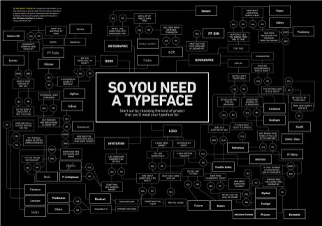
Here’s something for the font geek in your life

Filed under: Humour, Media, Randomness — Tags: , — Nicholas @ 10:43


Click the image to embiggenate.

H/T to Inspiration Lab.

January 10, 2010

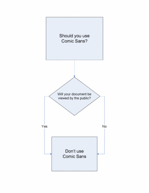
You can get too passionate about . . . fonts

Filed under: Humour, Media, Technology — Tags: , — Nicholas @ 22:23

H/T to Virginia Postrel.

Powered by WordPress