Quotulatiousness

October 20, 2018

Don’t waste your time coming up with something original … use this map for your next RPG campaign

Filed under: Gaming, Humour — Tags: , , — Nicholas @ 03:00

The Only Fantasy World Map You’ll Ever Need
by EotBeholder

Thrown together on a whim, yet meeting the needs of busy (or lazy) Dungeon Masters to this day, EotBeholder’s epic “Only Fantasy World Map” has all your role-playing game geography requirements covered.

Here’s something I threw together for the game I’m running with some coworkers. I plotted out where everything was going to go on a world map then decided, yknowwhat, let’s just keep the serial numbers filed off, so now it’s a map good for every RPG setting ever. Starting in the Tiny Bickering Fiefdoms is traditional but anywhere works. (My players are mostly from Tortuga.)

EDIT: Wow, almost four years later and this thing just exploded. The internet is a thing of mysteries. Thank you all! A lot (well, a number) of people have requested a blank version so they can add their own names… yeah, sure thing. To anyone asking for permission to use this for their own campaigns… I mean it hardly qualifies as “original”, so as long as you’re comfortable stealing from someone who steals from the people who only steal from the best, knock yourselves out 🙂

If I could make some additions (which I suppose I could, but, nah) I’d call out the Boring/Doomed Pastoral Village somewhere in the Tiny Bickering Fiefdoms or the Land of Poncy Knights, and also add a Giant Wall to Keep the Monsters Out. Giant walls are so hot right now.

H/T to Rob Beschizza for the link.

October 17, 2018

How Toronto got its name

Filed under: Britain, Cancon, France, History — Tags: , , , — Nicholas @ 03:00

Colby Cosh on the origins of the name of Canada’s largest city (which, surprisingly, isn’t the Mississauga name for “big stink on the water”):

Detail from a 1688 map of western New France by Vincenzo Coronelli that locates “Lac Taronto” at Lake Simcoe.
City of Toronto Culture Division/Library and Archives Canada via the National Post

By the time of Franquelin, “Tkaronto” had already become “Taronto,” a generic name for the highway between Lake Simcoe and Lake Ontario. The Humber River was called the Toronto River by the French before Gen. John Graves Simcoe and the British got hold of everything. The word, in turn, became attached to a trading settlement at the southern end of the trail — a pretty crummy place, by all accounts, but one destined for bigger things as part of a global seafaring empire.

The miracle is that it held on to the name. Simcoe insisted that “Toronto,” on being anointed as the site of the new capital of Upper Canada in 1793, be dubbed “York” in honour of Prince Frederick (1763-1827), Duke of York and second son of George III. This Duke of York is the “Grand Old Duke of York” from the satirical verse about military futility. He was also commander-in-chief of the British armies that helped to chase Napoleon out of Europe twice, and is thought to deserve genuine credit for this, so be careful who you write insulting rhymes about.

Simcoe dubbed Toronto “York” just because he was sucking up to a very identifiable future boss, and for no other reason. The people of Toronto seem to have understood this and resented it. In the decades to come, it was occasionally observed that there were something like a dozen other places in Upper Canada called “York.” Moreover, Simcoe’s “Little York,” as it was often called, seems to have presented an increasingly embarrassing parallel with the Americans’ bustling New York.

In 1834, when the Legislative Council of Upper Canada decided that the capital needed to be formally incorporated as a city, the citizenry remembered that they belonged to “Toronto” and appealed to the council to have the more musical old name restored. Over four decades their annoyance had not receded. Diehards who wanted York to remain York for imperial-grandeur reasons were outvoted, and Toronto’s formal Act of Incorporation observes that “it is desirable, for avoiding inconvenience and confusion, to designate the Capital of the Province by a name which will better distinguish it.” The appellation “Toronto,” of course, had actually been nicked from a spot some way off, but the white settlers had mislaid that information, and didn’t check with anyone who would know better.

July 1, 2018

Mapping medieval trade routes

Filed under: Africa, Asia, Economics, Europe, History — Tags: , — Nicholas @ 05:00

Open Culture linked to a fascinating new map by a Swedish grad student, showing trade routes during the Medieval period:

A small portion of Martin Jan Månsson’s trade map of the Middle Ages.

“I think trade routes and topography explains world history in the most concise way,” Månsson explains in the very small print at the map’s lower right corner. “By simply studying the map, one can understand why some areas were especially important–and remained successful even up to modern times.”

The map covers 200 years, spanning both the 11th and 12th centuries, and “depicts the main trading arteries of the high Middle Ages, just after the decline of the Vikings and before the rise of the Mongols, the Hansa and well before the Portuguese rounded the Cape of Good Hope.”

It also shows the complex routes already available to Africa and Asia, and the areas where Muslim and Christian traders would meet. The open-to-trade Song Dynasty ruled China, and the competitive kingdoms in the Indonesia region provided both Muslims and Europeans with spice.

Looking like a railway map, Månsson’s work shows how interconnected we really were back in the Middle Ages, from Greenland in the west to Kikai and Kagoshima in the East, from Arkhangelsk in the frozen north to Sofala in modern-day Mozambique.

The full-sized, high-resolution map can be downloaded here.

Update: Tim Worstall was kind enough to link to this post and uses Månsson’s map to help explain the gravity model of trade:

A standard observation is that places which are closer together trade with each other more than places which are further apart. Add to that the thought that larger economies will trade more with other larger economies – well, you know, more economic activity means more economic activity – and you get the gravity model of trade. So, therefore Britain’s trade future lies with those places nearby, in the EU, than with places further away like the Commonwealth or the US.

This is, sadly, actually the level of debate over Brexit at times. We should trade with France because it’s 26 miles away, so there. The point being that while the gravity model is true – among the best empirically supported of all economic observations – that’s not actually what it says. Rather, that those places which are closer by trade distance trade more with each other. Trade distance being a more complex point than mere geographical location.

[…]

The point here being that by showing the trade routes it is showing us this trade, or perhaps economic, distance which is what the gravity model is about. Valencia and Palma were very much closer – and trade very much more – than Valencia and Toledo, despite roughly equal distances crowfly wise.

June 30, 2018

Adventures in Sicilian non-verbal communication

Filed under: Europe, Humour, Italy — Tags: , , , , , — Nicholas @ 06:00

At El Reg, Alistair Dabbs recounts some tales from a recent trip to Italy:

This isn’t the first time I have strayed into a Twilight Zone of cross-lingual and intercultural bafflement during this vacation. Throwing caution to the wind a few days earlier, I’d rashly allowed Google Maps to plot a walking route from the centre of Palermo to La Zisa. Why I did this, I cannot say, especially given my poor experience of Google Maps’ walking routes in the past. This is, after all, the app that once directed me to walk through the centre of an unlit Hyde Park at 2am and whose audio inexplicably but routinely barks “Turn left!” when you’re supposed to turn right.

On this occasion, Google Maps decided to take me on a scenic tour of the city’s most impoverished slums. Given that what few pavements existed along the way were knee high in refuse and canine excretia, it was less of a walking route than a wading route. The final 100 metres appeared to be some kind of theme park attraction along the lines of Disney World’s “Pirates of the Caribbean”, except this was “Dope-addled Inbreds of the Mediterranean”.

To access this den of iniquità, I had to pass through one of those pedestrian gates design to stop cyclists from riding through it. It was blocked by a tweenager who’d been trying to ride his bicycle through it and got stuck. The unlikely resolution of such an attempt was emphasised by two obvious challenges: it was an adult bike and the boy was so fat that he looked like an inflatable sofa. Both the bicycle and his body were at least two sizes too big for him.

By waving his arms around, he indicated that I was welcome to pass through the gate. By waving my arms back at him, I indicated that I would certainly do so after he had extricated himself. This attracted some shifty onlookers who helpfully grunted and waved their arms around at both of us until eventually we were all gesticulating like delegates at a semaphore convention.

Fearing an unfortunate outcome from this clash of cultures in unfamiliar territory, I coaxed the fat kid and his bike out of the gate and taught him to play the banjo he was carrying, ending with a spontaneous duet between the two of us. It was only by sheer luck that I’d remembered to pack my bagpipes.

March 24, 2018

James May doesn’t trust Sat Navs | Q&A extras | HeadSqueeze

Filed under: Technology — Tags: , , , — Nicholas @ 02:00

BBC Earth Lab
Published on 27 Sep 2013

Don’t trust the Sat Nav! Speaking from experience, James thinks we shouldn’t blindly trust a machine. Get a map!

February 14, 2018

Viral mapping by Sasha Trubetskoy

Filed under: Australia, Cancon, History, Media — Tags: — Nicholas @ 03:00

Have you seen this map by Sasha Trubetskoy?

Click to embiggen.

It wasn’t the first time one of his maps went viral, but it provided him a key insight into getting his maps in front of a large number of people:

I learned from Reddit that if a Canadian sees something that mentions Canada, they will upvote out of solidarity. You can game that. So I made a map of every Canadian province, if every Canadian province proposal had succeeded. Not many people know Jamaica was going to be part of Canada. That map got me on Huffington Post Canada.

I was like, Canada worked, let’s try Australia. Same idea, every Australian state proposal. That worked too.

A very popular recurring theme in viral maps is a fictional subway network of some sort. I can see why people like that. It’s cute, it’s bright colors, everything’s nice and organized, it’s fun to look at.

Somehow I stumbled upon the idea of representing the ancient Roman road network. I tried to make it look like a modern publication that the actual Roman Empire would have, like little leaflets at the train station. The map is in Latin. I don’t know Latin, but I have a knack for picking up little bits and pieces, maybe born out of necessity from my childhood. My parents come from Moscow, and at home we only spoke Russian. My grandma speaks French.

Latin has six cases, Russian has six cases, and they’re essentially the same. I had an intuition, like, how would I say this in Russian? Then replace the words with Latin. It turns out that’s a fantastic way of doing it.

H/T to Colby Cosh for the link.

January 25, 2018

Looking deeper than just England, Scotland, Wales and Northern Ireland

Filed under: Britain, Humour — Tags: , , , — Nicholas @ 05:00

H/T to @GarethSoye for posting this one (originally from Brilliant Maps):

[Click to see full-sized image]

January 10, 2018

Re-partitioning Australia

Filed under: Australia, Humour — Tags: — Nicholas @ 03:00

Jessica Brisbane posted this to Facebook:

[Click to embiggen]

September 7, 2017

Roman Roads of Britain

Filed under: Britain, History — Tags: , , , — Nicholas @ 04:00

Last month, Colin Marshall shared this post on Open Culture:

[Click to embiggen]

Though some of Britain’s Roman Roads have become modern motorways, most no longer exist in any form but those bits and pieces history buffs like to spot. This makes it difficult to get a sense of how they all ran and where — or at least it did until Sasha Trubetskoy made a Roman Roads of Britain Network Map in the graphic-design style of the subway maps you’ll find in London or any other major city today. Trubetskoy, an undergraduate statistics major at the University of Chicago, first found cartographical fame a few months ago with his “subway map” of roads across the entire Roman Empire circa 125 AD.

“Popular request,” he writes, demanded a Britain-specific follow up, a project he describes as “far more complicated than I had initially anticipated.” The challenges included not just the sheer number of Roman Roads in Britain but a lack of clarity about their exact location and extents. As in his previous map, Trubetskoy admits, “I had to do some simplifying and make some tough choices on which cities to include.” While this closer-up view demanded a more geographical faithfulness, he nevertheless “had to get rather creative with the historical evidence” in places, to the point of using such “not exactly Latin-sounding” names as “Watling Street” and “Ermin Way.”

August 3, 2017

QotD: Improved quality of life doesn’t always show up in GDP figures

Filed under: Business, Economics, Quotations, Technology — Tags: , , , , — Nicholas @ 01:00

We economists marvel, too, but we also wonder how free apps fit into GDP. They do have their long-run downside, as we forget how to read maps and plot routes ourselves. (Anybody out there remember how to work a slide rule? No? That’s not a loss for computation but it does mean lower average numeracy.) But in the short run they save billions of hours in wrong turns not taken and trillions of cells of stomach lining no longer eaten up by travel anxiety. Not to mention their entertainment value.

But hardly any of that very big upside shows up in GDP. In one respect, in fact, GDP goes down. I used to buy maps, including travel atlases. I’m unlikely to do that anymore. Maps purchased by consumers are a “final good or service” and thus do enter into GDP. Maps I interact with online but don’t pay for aren’t GDP. So well-being has gone up — a lot — as a result of Google Maps. But GDP may well have gone down.

In fact, apps do produce some GDP. Google sustains itself in part by selling ads, including to retailers and restaurants looking to pay for prominent mention on its map display. Its ad revenue is an intermediate input into GDP. Many of the entities buying Google ads are in the business of selling “final goods or services” and if they’re money-making, the prices of their goods have to cover the cost of their ads. So by that circuitous route the “value” of the apps does end up in GDP.

But what’s the relationship between what advertisers pay for my eyeballs and the value of the app to me? The two are not completely unrelated. The more I use the app the more I’m likely to buy the advertised products, presumably. But in practice, the probability of my buying is pretty small while my benefit from the app is pretty big. How strange that miracle apps can change our lives but not our GDP.

William Watson, “How using Google Maps on your summer road trip messes with the GDP”, Financial Post, 2017-07-18.

April 15, 2017

Charles Joseph Minard

Filed under: Europe, France, History, Russia — Tags: , — Nicholas @ 03:00

I first encountered Charles Joseph Minard’s best-known work in Edward Tufte’s The Visual Display of Quantitative Information in the late 1980s:

The map’s French caption reads:

Figurative Map of the successive losses in men of the French Army in the Russian campaign 1812-1813.

Drawn up by M. Minard, Inspector General of Bridges and Roads in retirement. Paris, November 20, 1869.

The numbers of men present are represented by the widths of the colored zones at a rate of one millimeter for every ten-thousand men; they are further written across the zones. The red [now brown] designates the men who enter into Russia, the black those who leave it. —— The information which has served to draw up the map has been extracted from the works of M. M. Thiers, of Segur, of Fezensac, of Chambray, and the unpublished diary of Jacob, pharmacist of the army since October 28th. In order to better judge with the eye the diminution of the army, I have assumed that the troops of prince Jerome and of Marshal Davoush who had been detached at Minsk and Moghilev and have rejoined around Orcha and Vitebsk, had always marched with the army.

The scale is shown on the center-right, in “lieues communes de France” (common French league) which is 4,444m (2.75 miles).

The lower portion of the graph is to be read from right to left. It shows the temperature on the army’s return from Russia, in degrees below freezing on the Réaumur scale. (Multiply Réaumur temperatures by 1¼ to get Celsius, e.g. −30°R = −37.5 °C) At Smolensk, the temperature was −21° Réaumur on November 14th.
(Image and translation from Wikimedia)

In National Geographic, Betsy Mason reveals more about the man who created the “best graphic ever produced”:

Charles Joseph Minard’s name is synonymous with an outstanding 1869 graphic depicting the horrific loss of life that Napoleon’s army suffered in 1812 and 1813, during its invasion of Russia and subsequent retreat. The graphic (below), which is often referred to simply as “Napoleon’s March” or “the Minard graphic,” rose to its prominent position in the pantheon of data visualizations largely thanks to praise from one of the field’s modern giants, Edward Tufte. In his 1983 classic text, The Visual Display of Quantitative Information, Tufte declared that Napoleon’s March “may well be the best statistical graphic ever produced.”

Today Minard is revered in the data-visualization world, commonly mentioned alongside other greats such as John Snow, Florence Nightingale, and William Playfair. But Minard’s legacy has been almost completely dominated by his best-known work. In fact, it may be more accurate to say that Napoleon’s March is his only widely known work. Many fans of the March have likely never even seen the graphic that Minard originally paired it with: a visualization of Hannibal’s famous military campaign in 218 BC, as seen in the image below.

Graphic information of the men losses in the raid of the troops of Hannibal from Spain to Italy (Wikimedia)

On its face, it may not seem remarkable that Minard is remembered for this one piece of work; after all, many people owe their fame to a single great achievement, and the Napoleon graphic is certainly worthy of its reputation. But Minard was most definitely not a one-hit wonder.

March 29, 2017

You can’t really understand history without considering the geography

Filed under: Americas, Asia, Books, Economics, History — Tags: , — Nicholas @ 04:00

At Samizdata, Brian Micklethwait discusses Tim Marshall’s book, Prisoners of Geography:

Britain and Western Europe, and then the other parts of the world where English is the dominant language, have mostly been blessed with a degree of geographically conferred freedom of manoeuvre that is denied to the inhabitants of pretty much all other nations. That is why these places got rich first. And it also now means that we Euros and Anglos are able to believe, as a matter of practical political policy rather than merely as privately pious aspiration, in a wide range of idealistic things of very variable value – things like freedom, democracy, equality, human rights, freedom for women, “social justice”. and so on and so forth – things that geographically more constrained people can only, as yet, dream of, and which they often regard as more as a threat to their own ways of doing things than as any kind of promise.

[…]

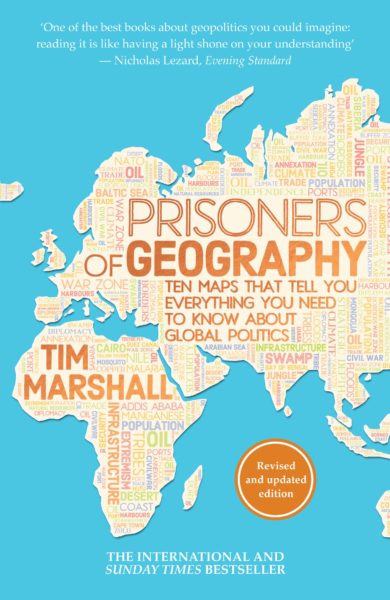
The word “maps” being in its subtitle, along with the bombastic claim that these maps tell you all you need to know about the world, these maps ought to be really, really well done, from the graphic point of view. But to my admittedly fading eye, they seemed to be not that good. On their own, they tell you nothing like everything about the world, which is why you actually need to read the book to get the points of all the maps. I was particularly disappointed by how the mountains look in these maps. Along with rivers, mountains are a big deal in this book, as you would expect them to be. But, in these maps, the mountains often scarcely register. It doesn’t help that the maps are done only with black ink on white paper. Colour would have helped. But even black ink could have been used, I feel, with somewhat greater clarity. I had to look quite hard to work out where these various mountains were. But, as I say, maybe that’s just me. My eyesight is definitely not what it was.

The mountainous insight I recall with particular pleasure is Marshall’s observation that the hostility between India and China would have been and would now be far greater, were it not for the most impenetrably formidable mountains on earth being at the boundary between these two civilisations. Contrast those impenetrable Asian mountains with that famous gap in the mountains in northern Europe, which results in a gigantic military parade ground with no natural barriers stretching from the Pyrenees to the Urals.

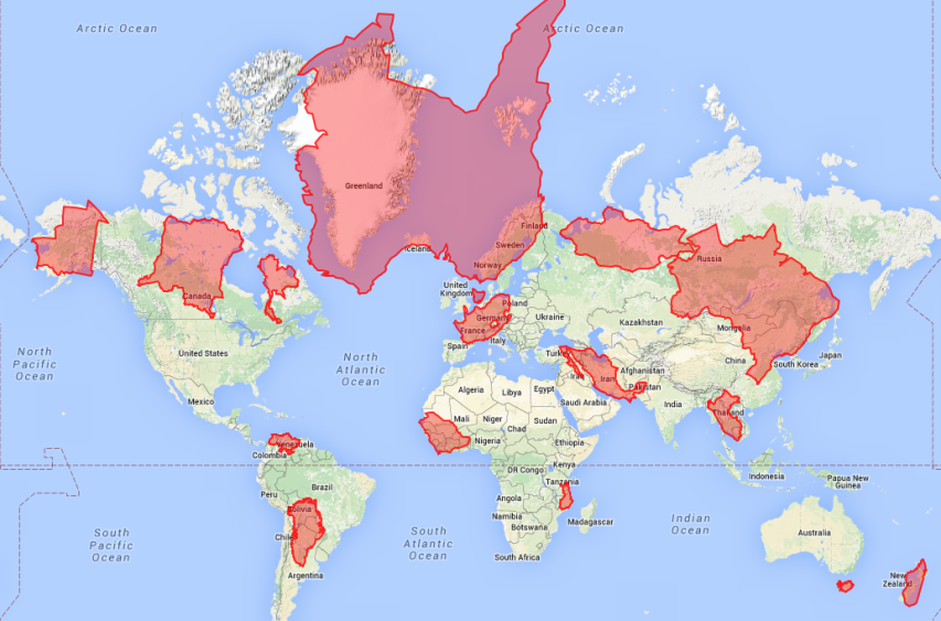
In addition to knowing better about Europe’s mountains, I now sort of know a whole lot more than I did about the mountains of South America. South America is, for me, one of the less fascinating places in the world, because, being so geographically cut off from the rest of the world and being of significance mostly only to their northern neighbours, South American mistakes count for a lot less than mistakes can elsewhere, especially mistakes made by the USA and Europe of course. South America, you might say, is basically just a big clutch of European mistakes.

Speaking of European mistakes, Marshall is very good on the habit of late nineteenth century Europeans of drawing straight lines upon maps of foreign parts, in defiance of geographical and consequent social and cultural and now “national” realities on the ground. The USA gets along fine despite all the straight lines that it contains dividing its states, because these states are, fundamentally, still very united, at least in the sense that everyone in them is quarrelling about the same things within the same political institutions. But the Middle East is still trying to shake free of its baleful legacy of fake states, which Europeans and now also Americans, all motivated by the need for oil, have expended so much of their own treasure and so much Middle Eastern blood trying to keep in being.

December 6, 2016

Bowmanville, Ontario from 1984-2016 in Google Timelapse

Filed under: Cancon — Tags: , , , , , — Nicholas @ 09:57

Description from the Timelapse page:

Timelapse

Timelapse is a global, zoomable video that lets you see how the Earth has changed over the past 32 years. It is made from 33 cloud-free annual mosaics, one for each year from 1984 to 2016, which are made interactively explorable by Carnegie Mellon University CREATE Lab’s Time Machine library, a technology for creating and viewing zoomable and pannable timelapses over space and time.

Using Earth Engine, we combined over 5 million satellite images acquired over the past three decades by 5 different satellites. The majority of the images come from Landsat, a joint USGS/NASA Earth observation program that has observed the Earth since the 1970s. For 2015 and 2016, we combined Landsat 8 imagery with imagery from Sentinel-2A, part of the European Commission and European Space Agency’s Copernicus Earth observation program.

December 6, 2015

The American Civil War: Every Day

Filed under: History, Military, USA — Tags: , — Nicholas @ 03:00

Published on 31 Oct 2014

See every day of the American Civil War unfold as the Union fights against the Confederacy to reunite the country in a bitter struggle.
Legend:
Maroon = Confederate States of America and territories
Red = Areas occupied by Confederate forces
Pink = Gains for that Day
Dark Blue = United States of America and territories
Blue = Areas occupied by Union forces.
Light blue = Gains for that day
Yellow = Border states / disputed areas.

H/T to BoingBoing for the link.

November 24, 2015

The Mercator Puzzle

Filed under: Randomness — Tags: — Nicholas @ 03:00

How badly distorted is your mental map of the world thanks to the use of the Mercator projection? You can test yourself right here in your web browser with The Mercator Puzzle. Click on the image below, then drag each distorted country outline to its correct location on the underlying map:

Click the image to play in your browser

Click to play in your browser

H/T to Laura Hudson for the link.

« Newer PostsOlder Posts »

Powered by WordPress