I managed to miss the initial controversy about a typographical hoax that might not have been so hoax-y:
According to the website of the Independent newspaper, LEGO UK has verified the 1970s ‘letter to parents’ that was widely tweeted last weekend and almost as widely dismissed as fake. Business as usual in the Twittersphere — but there are some lessons here about dating type.
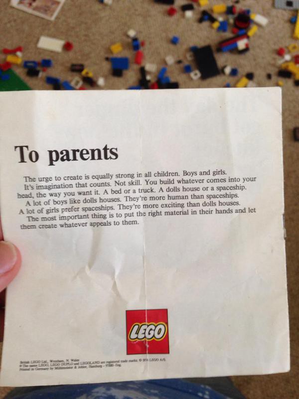
‘The urge to create is equally strong in all children. Boys and girls.’ It’s a sentiment from the 1970s that’s never been more relevant. Or was it?
Those of us who produce or handle documents for a living will often glance at an example and have an immediate opinion on whether it’s real or fake. That first instinct is worth holding on to, because it comes from the brain’s evolved ability to reach a quick conclusion from a whole bunch of subtle clues before your conscious awareness catches up. It’s OK to be inside the nearest cave getting your breath back when you start asking yourself what kind of snake.
But sometimes you will flinch at shadows. Why did this document strike us as wrong when it wasn’t?
First, because the type is badly set in exactly the way early consumer DTP apps, and word processor apps to this day (notably Microsoft Word), set type badly — at least without the intervention of skilled users. I started typesetting on an Atari ST, the poor man’s Mac, in 1987. The first desktop publishing program for that platform was newly released, running under Digital Research’s GEM operating system. It came with a version of Times New Roman, and almost nothing else. Me and badly set Times have history.
In the LEGO document, the kerning of the headline is lumpy and the word spacing excessive. The ‘T’ seems out of alignment with the left margin, even after allowing for a lack of optical adjustment. The paragraph indent on the body text has been applied from the start, contrary to modern British typesetting practice; the first line should be full-out. The leading (vertical space between lines of text) is not quite enough for comfort, more appropriate to a dense newspaper column than this short blurb.
There’s also an error in the copy: ‘dolls houses’ needs an apostrophe. Either before or after the last letter of ‘dolls’ would be fine, depending on whether you think you mean a house for a doll or a house for dolls. But it definitely needs to be possessive.
It wasn’t just that the type looked careless. It was that it stank of the careless use of tools that shouldn’t have been available to its creators.